Home
Templates
Design Systems
Use Cases
Contact
Back to design aesthetics
Share
Save
20th Century Breakfast House Editorial
/20thCenturyBreakfastHouseEditorial
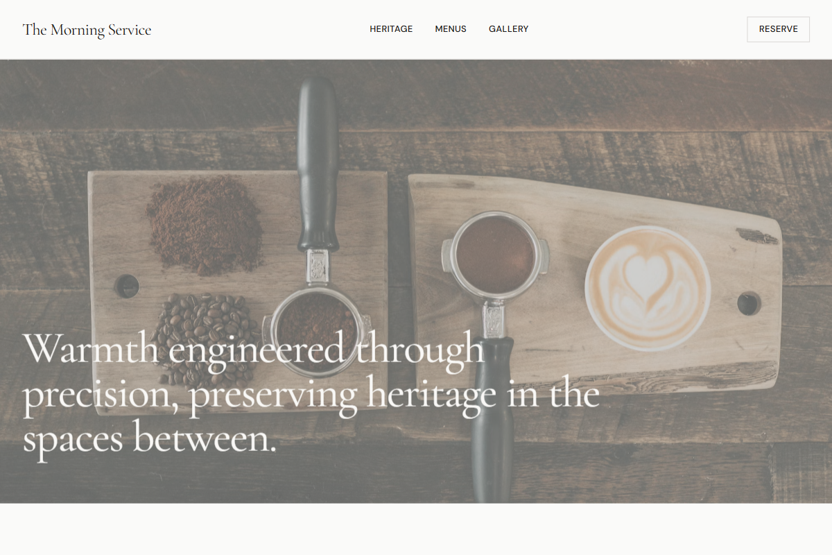
A refined vintage-modern direction inspired by early-to-mid 20th century cafés, breakfast rooms, printed menus, and classic hospitality signage. Use Recoleta, ITC Cheltenham, or Cormorant Garamond for expressive headings, paired with Neue Haas Grotesk, Söhne, or Gill Sans-style sans-serif for compact navigation and UI. Keep hero type around 54–64px, section headings at 42–50px, body copy at 18–20px, and nav at 13px with subtle tracking. Build the palette from aged ivory, oatmeal beige, silver gray, dark roast brown, faded black, and burnt orange. Use a calm off-white navbar, full-bleed photographic hero, centered serif origin essay, image-right split layouts, menu boards with fine rules, and alternating editorial text sections. Add restrained archival cues: thin borders, small caps labels, menu-number styling, and polished photographic crops.
0 likes
0 bookmarks
Jul 25, 2026
Copy Design Aesthetic