Home
Templates
Design Systems
Use Cases
Contact
Back to design aesthetics
Share
Save
Alpine Glass App Classic
/alpineGlassAppClassic
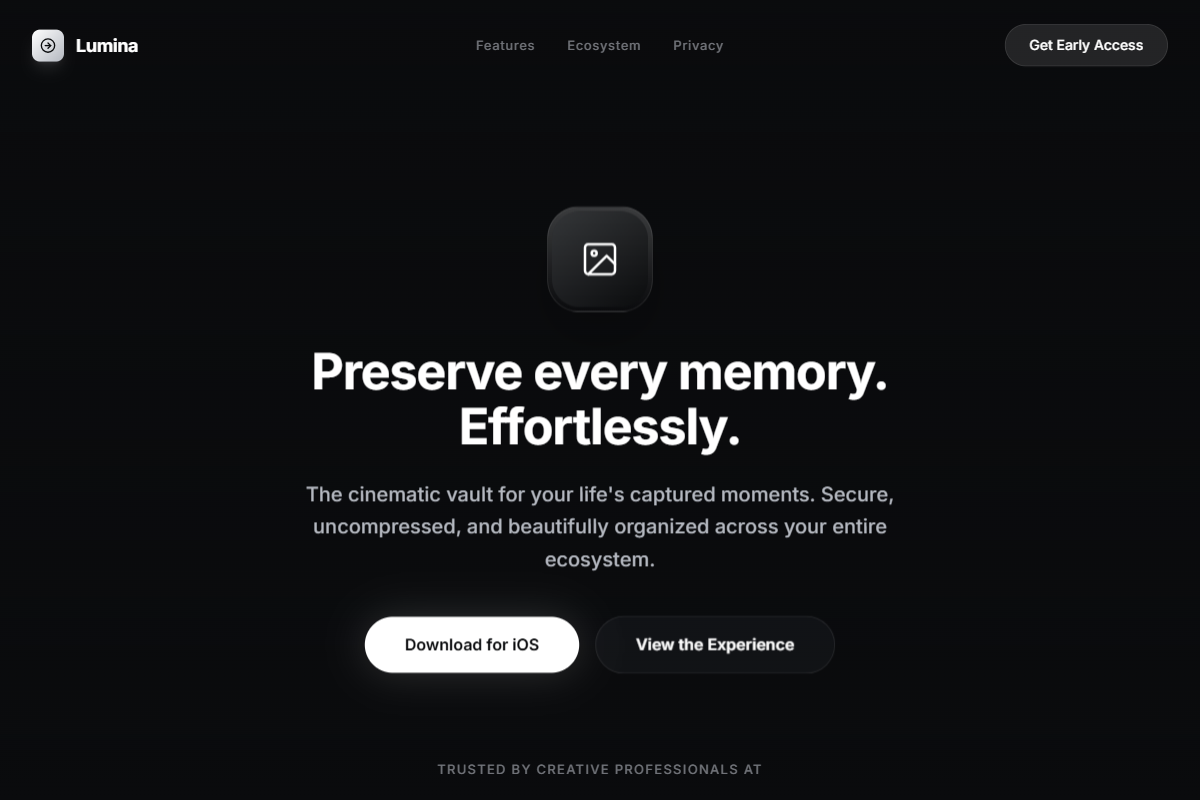
A polished dark-theme landing page aesthetic built around a full-viewport nature hero, crisp centered hierarchy, and reusable app-launch structure. Use Inter, SF Pro, or Helvetica Now with a refined scale: 44–50px hero headline, 18–20px paragraph, 13–14px nav labels, and 34–40px feature headings. Build the palette from alpine black, deep pine, storm charcoal, mist gray, snow white, and warm ivory for fully rounded CTA buttons. The hero should use a cinematic mountain, forest, lake, or fog landscape as a full-bleed background with a dark gradient overlay, centered app icon, headline, paragraph, and pill CTAs. Below, place a centered row of phone mockups in frosted glass tiles. Feature sections should alternate concise text blocks with large rounded screenshots, subtle borders, soft glass panels, and generous Framer-level spacing.
0 likes
0 bookmarks
Jul 10, 2026
Copy Design Aesthetic