Home
Templates
Design Systems
Use Cases
Contact
Back to design aesthetics
Share
Save
Blue Ink Corner Table
/blueInkCornerTable
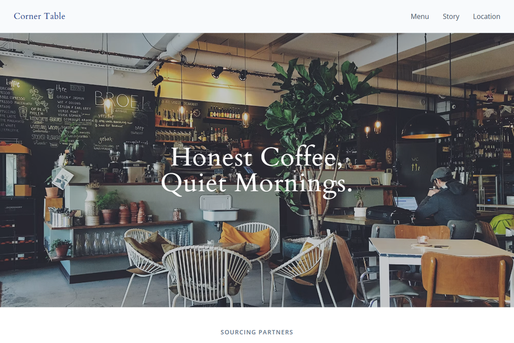
Design philosophy: build a calm, reusable café system with the confidence of a printed neighbourhood menu and the familiarity of a mid-2010s small-business website. Core beliefs: trust comes from honest imagery, dependable structure, and type that feels readable before it feels fashionable. Strict rules: light navbar, 80vh hero with soft daylight photography, blue-ink CTA, plain text menu link, centered welcome copy, one owner-note section, one image-led feature strip, menu as a ruled list with aligned pricing, and practical location details. Typography philosophy: use Cardo, Vollkorn, or Times New Roman refined with letterspacing, paired with Open Sans, Roboto Slab, or Source Sans 3. Palette: clean white, blue-white gray, cool slate, blue ink, graphite, small cranberry accent. Spacing: measured, calm, and maintainable; no dense cards. Motion: hover states only. Imagery: cups near windows, counter service, cakes, exterior sign. Refuses badges, testimonials, AI illustrations, chalkboard gimmicks, beige, and SaaS gradients. Mediocre implementation: generic navy template. Common mistakes: over-dark overlays, cramped menu rows, inconsistent heading scale.
0 likes
0 bookmarks
Aug 20, 2026
Copy Design Aesthetic