Home
Templates
Design Systems
Use Cases
Contact
Back to design aesthetics
Share
Save
Burnt Orange Counter Broadsheet
/burntOrangeCounterBroadsheet
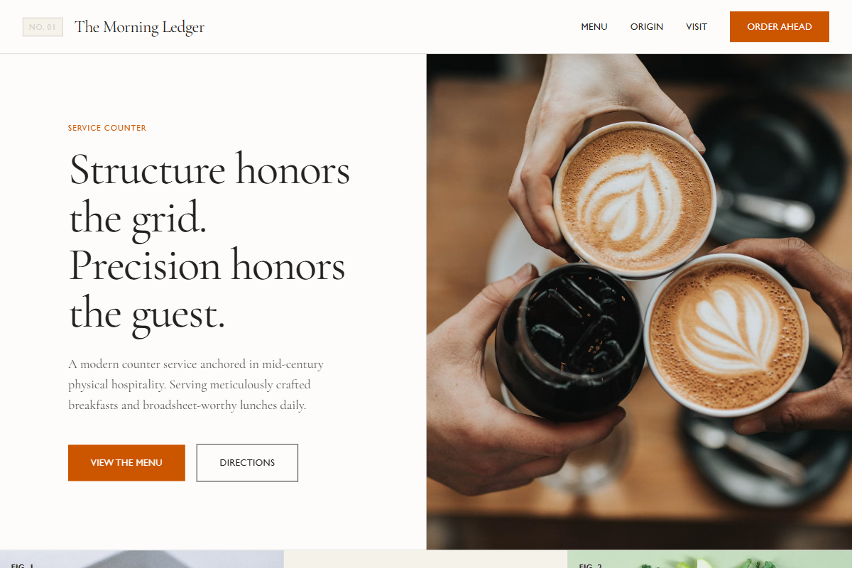
A sharper vintage-modern aesthetic inspired by 20th-century counter service, printed broadsheets, tiled interiors, and confident typographic hierarchy. Use Cormorant Garamond, Signifier, or Libre Baskerville for elegant headings and origin copy, paired with Gill Sans, Söhne, or Neue Haas Grotesk for compact navigation, buttons, and menu metadata. Keep hero headlines at 56–64px, paragraph text at 18–19px, nav at 13px with subtle letterspacing, section headings at 42–50px, and compact menu descriptions at 15–16px. Use porcelain white, aged cream, silver gray, walnut brown, faded black, and burnt orange accents for CTAs, rules, review stars, and category tabs. Compose with full-screen photography, off-white top navigation, centered document-style copy, image-right split sections, menu boards with fine dividers, testimonial blocks, and alternating image/editorial bands. Add small caps labels, restrained borders, archival numbering, and crisp hover transitions.
0 likes
0 bookmarks
Jul 26, 2026
Copy Design Aesthetic