Home
Templates
Design Systems
Use Cases
Contact
Back to design aesthetics
Share
Save
Chalk-White Ledger & Cornflower Counter Ink
/chalkwhiteLedgerCornflowerCounterInk
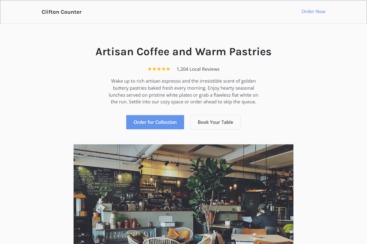
Design philosophy: a restrained book-designer layout built from chalk-white backgrounds, cool newspaper-grey blocks, pencil dividers, charcoal copy, golden yellow stars, and muted cornflower-blue ink used like a printed mark. Core beliefs: trust comes from alignment, good tables, practical content, and honest photography. Strict rules: light MVP.css navbar, narrow wrapper, short hero, review count near the headline, two flat CTAs, image-heavy midsection, menu rows with aligned names and prices, plain address and hours area. Typography philosophy: use sans pairings with 2015 familiarity but better discipline: Karla with Open Sans, Lato with PT Sans, or Droid Sans with Noto Sans. Spacing philosophy: compact reusable blocks, no showroom gaps, strong left edges after the hero. Motion philosophy: nearly static. Imagery: folded menus, white plates, cake stands, receipt paper. Refuses decorative frames, chalkboard clichés, beige paper, AI florals. Common mistakes: generic navy, weak greys, misaligned menu columns, fake vintage texture.
0 likes
0 bookmarks
Oct 3, 2026
Copy Design Aesthetic