Home
Templates
Design Systems
Use Cases
Contact
Back to design aesthetics
Share
Save
Deep Marine & Pale Aqua Editorial Tea Folio
/deepMarinePaleAquaEditorialTeaFolio
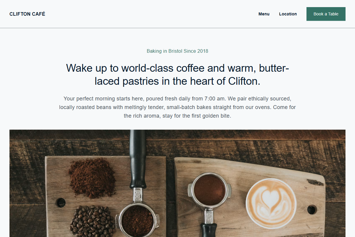
Design philosophy: a close-family exploration using a deep marine navbar, cool white surfaces, pale aqua-grey feature sections, crisp graphite dividers, golden review stars, and a dry blue-green accent reserved for booking actions and one confidence line. Core beliefs: the page should feel locally maintained yet designed by someone with print sensibility: honest, image-heavy, legible, and never theatrical. Strict rules: restrained hero heading, no oversized display type, large photographic opener, proof stars near the claim, alternating tinted modules, practical three-column section, document-style rows, and a tall parallax image section with a plain square notice overlay. Typography philosophy: combine Futura PT, Frutiger, Optima Sans alternatives, or Humanist 521; avoid default geometric startup sameness. Spacing: consistent gutters, modest vertical rhythm, aligned edges. Motion: subtle parallax, soft fades, hover darkening. Imagery: shelves, cups, counter corners, village frontage, printed menus. Refuses beige backgrounds, badges, avatars, cute icons, glossy gradients. Common mistakes: over-branded teal, weak overlay contrast, fake boutique polish.
0 likes
0 bookmarks
Sep 14, 2026
Copy Design Aesthetic