Home
Templates
Design Systems
Use Cases
Contact
Back to design aesthetics
Share
Save
Eclipse Glass App Theater
/eclipseGlassAppTheater
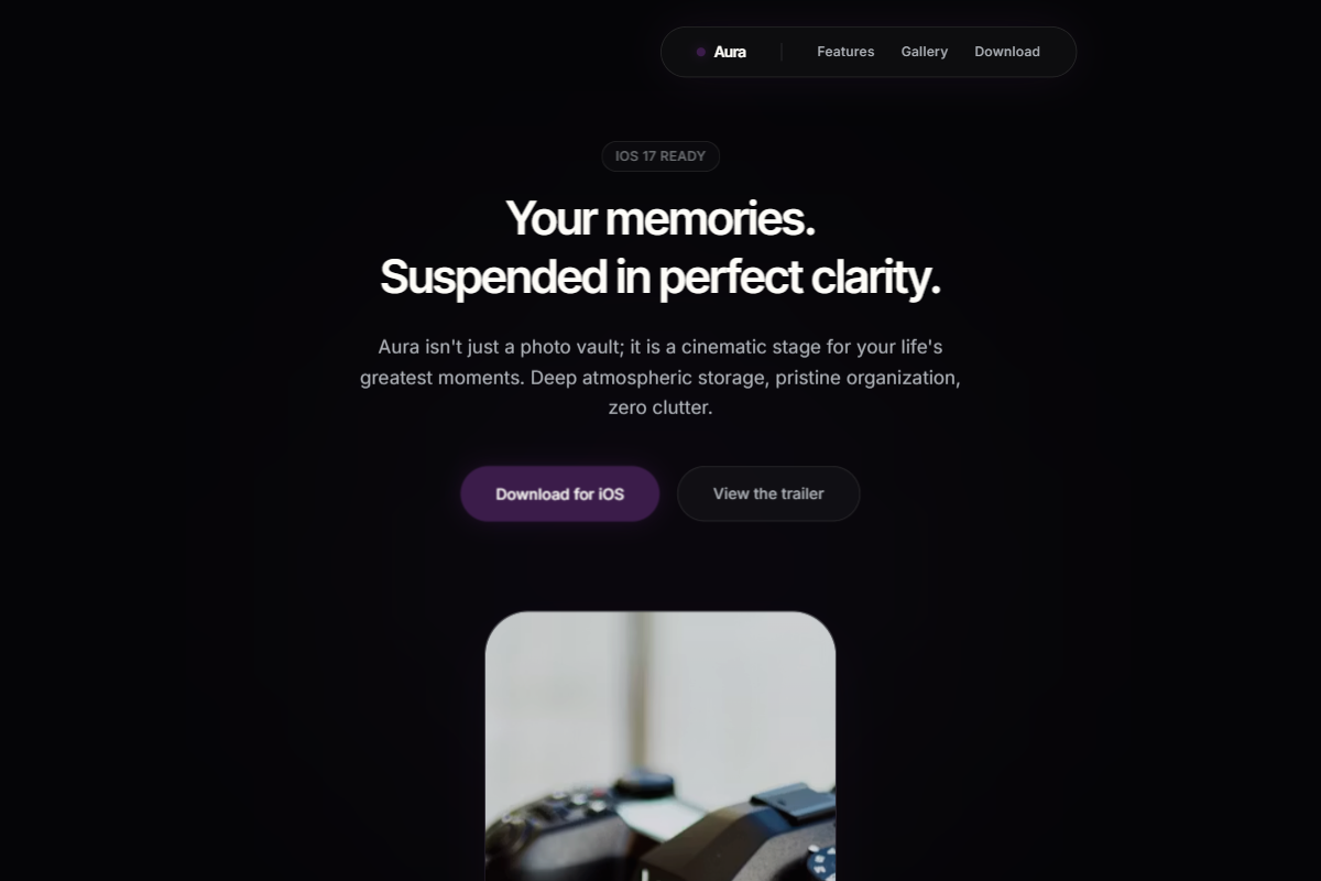
A dramatic dark-theme aesthetic that presents the product like a premium object on a cinematic stage. Use Geist or Inter Tight for crisp headings paired with Inter or Satoshi for body text, maintaining a restrained hierarchy: 38–42px centered hero headline, 17px body copy, small nav typography, and confident 34px section headings. The palette should combine eclipse black, graphite, smoky navy, violet shadow, silver mist, and warm white, with rounded CTAs in deep mulberry, oxblood, or ink-purple. The hero should feel minimal and atmospheric: floating translucent navbar, centered headline stack, pill buttons, subtle radial light behind a phone mockup, and generous empty space. Lower sections should use vertically centered containers, alternating feature rows, gradient-framed product shots, glass cards, soft cinematic shadows, and FAQ rows with thin luminous dividers.
0 likes
0 bookmarks
Jul 24, 2026
Copy Design Aesthetic