Home
Templates
Design Systems
Use Cases
Contact
Back to design aesthetics
Share
Save
Frosted Delft & Rowan Ink Review Register
/frostedDelftRowanInkReviewRegister
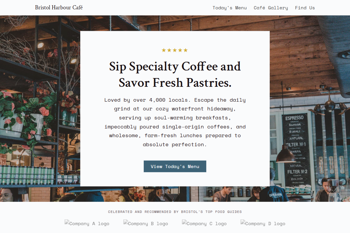
Design philosophy: a refined document-led landing page built from frosted-white backgrounds, pale Delft-blue washes, zinc dividers, deep rowan-ink typography, golden yellow stars, and a muted petrol-blue accent for decisive actions only. Core beliefs: trust is earned through readable proof, structured information, tactile photography, and a quietly old-web modularity. Strict rules: light horizontal navbar, hero with modest serif headline and image crop, review stars immediately visible, centered social-proof paragraph, alternating white and tinted sections, ruled menu rows that resemble hand-entered HTML tables, and a simple location panel. Typography philosophy: pair Vollkorn, Rufina, or Crimson Text headings with Space Mono, Cutive Mono, or Courier Prime body; keep headings 36–46px and body 16–18px. Spacing: airy leading, compact vertical rhythm, no luxury emptiness. Motion: fades and link underlines only. Imagery: table settings, printed receipts, frontage reflections. Refuses badges, avatars, chalkboards, AI florals. Common mistakes: navy heaviness, cramped tables, fake boutique polish.
0 likes
0 bookmarks
Sep 15, 2026
Copy Design Aesthetic