Home
Templates
Design Systems
Use Cases
Contact
Back to design aesthetics
Share
Save
Frosted Newsprint Plum-Black & Bitter-Pomegranate Review Register
/frostedNewsprintPlumblackBitterpomegranateReviewRegister
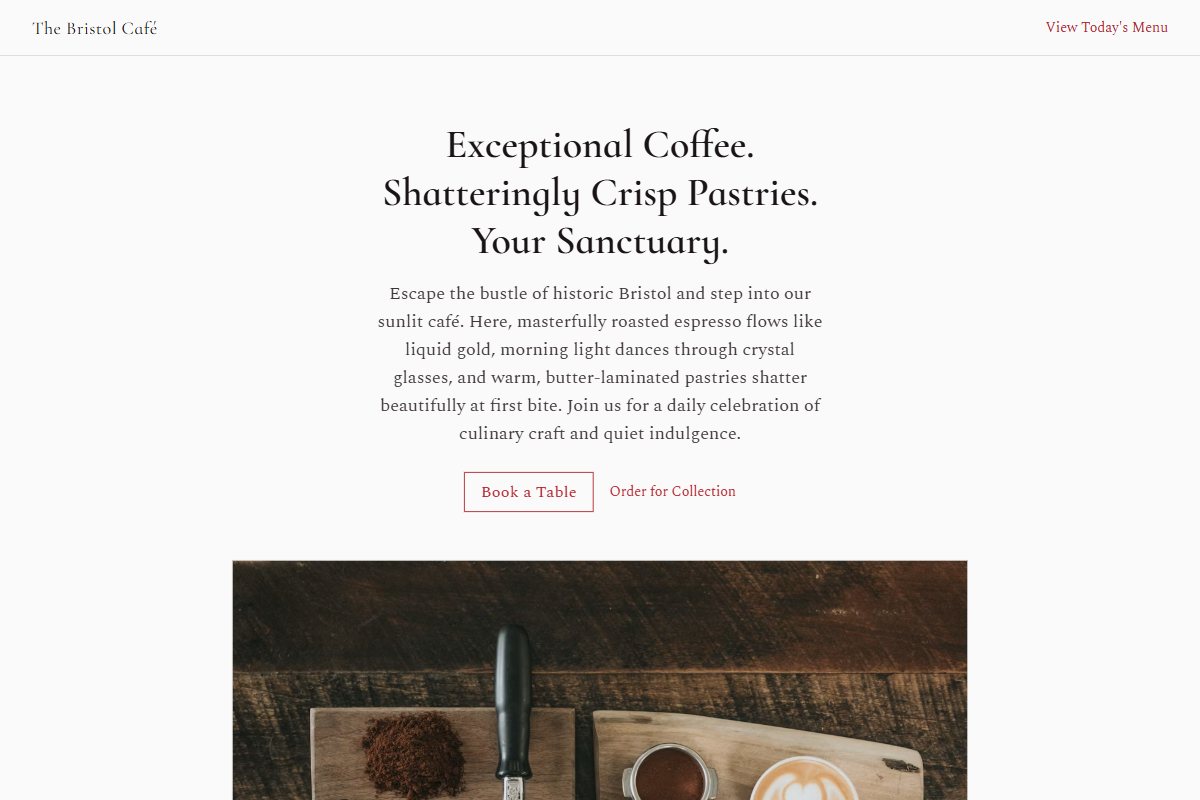
Design philosophy: an editorial newsprint system using frost-white pages, pale newspaper-grey bands, plum-black ink, cool graphite dividers, golden review stars, and bitter-pomegranate red as a narrow action colour. Core beliefs: sophistication should feel assembled by a book designer: structured, photographic, readable, and owner-maintainable. Strict rules: light slim navbar, centered hero with display heading no larger than 3xl, short copy, CTAs, image below, one-column menu like a printed listings page, 80%-width image grid with two images per row on a muted plum-grey background, compact CTA, and restrained footer. Typography philosophy: pair Grenze used lightly, Eczar, or Cormorant Infant headings with Gentium Book Plus, Cardo, or Spectral body. Spacing: newspaper-like rhythm, visible baselines, compact modules. Motion: fades only, with link darkening. Imagery: schedules, leather gloves, perfume-glass reflections, folded papers, red lipstick trace. Refuses gothic theatre, beige, ornate frames, AI florals. Common mistakes: sugary purple, theatrical darkness, oversized headings, excessive red.
0 likes
0 bookmarks
Sep 20, 2026
Copy Design Aesthetic