Home
Templates
Design Systems
Use Cases
Contact
Back to design aesthetics
Share
Save
Frosted Pearl Damson Window Bulletin
/frostedPearlDamsonWindowBulletin
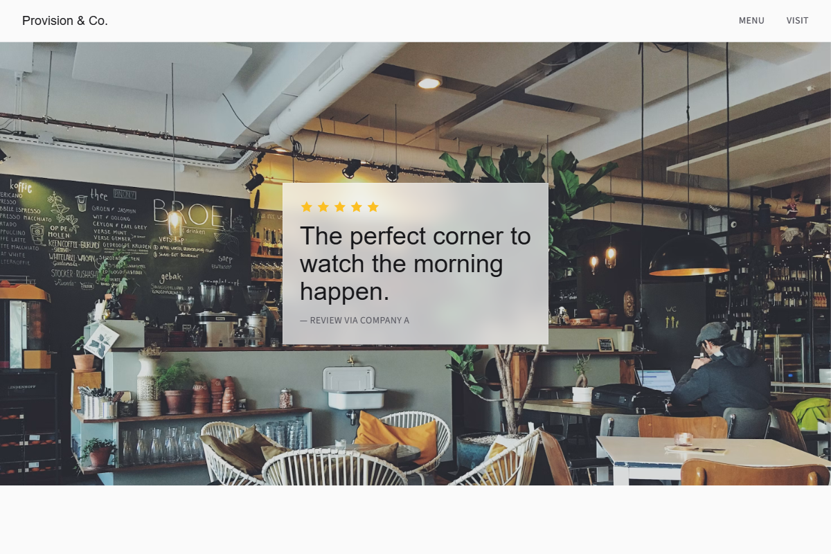
Design philosophy: create a softer editorial local-business page inspired by window notices, morning condensation, and neatly updated bulletin boards, using frosted pearl surfaces and a deep damson accent. Core beliefs: restraint should feel warm, not sterile; hierarchy, line length, and real photography carry the design. Strict rules: light pearl navbar, 80vh hero with window seating or doorway image, translucent social-proof panel with golden stars, damson CTA, understated menu link, centered review-led intro, generous alternating feature bands, one damson section with warm-white text, darkened background-image quote strip, ruled menu table, and location details divided with hairline rules. Typography philosophy: pair Scala Sans, Museo Sans, or Myriad Pro with Source Sans 3, Cabin, or dark DM Sans; controlled headline sizes. Spacing: editorial but owner-maintainable. Motion: opacity only. Imagery: glass, tables, staff hands, plain notices. Refuses decorative scripts, avatars, badges, beige, heavy textures. Mediocre implementation: gloomy purple café theme. Common mistakes: muddy damson, oversized headlines, illegible overlay text.
0 likes
0 bookmarks
Aug 21, 2026
Copy Design Aesthetic