Home
Templates
Design Systems
Use Cases
Contact
Back to design aesthetics
Share
Save
Glacier Pearl Launch System
/glacierPearlLaunchSystem
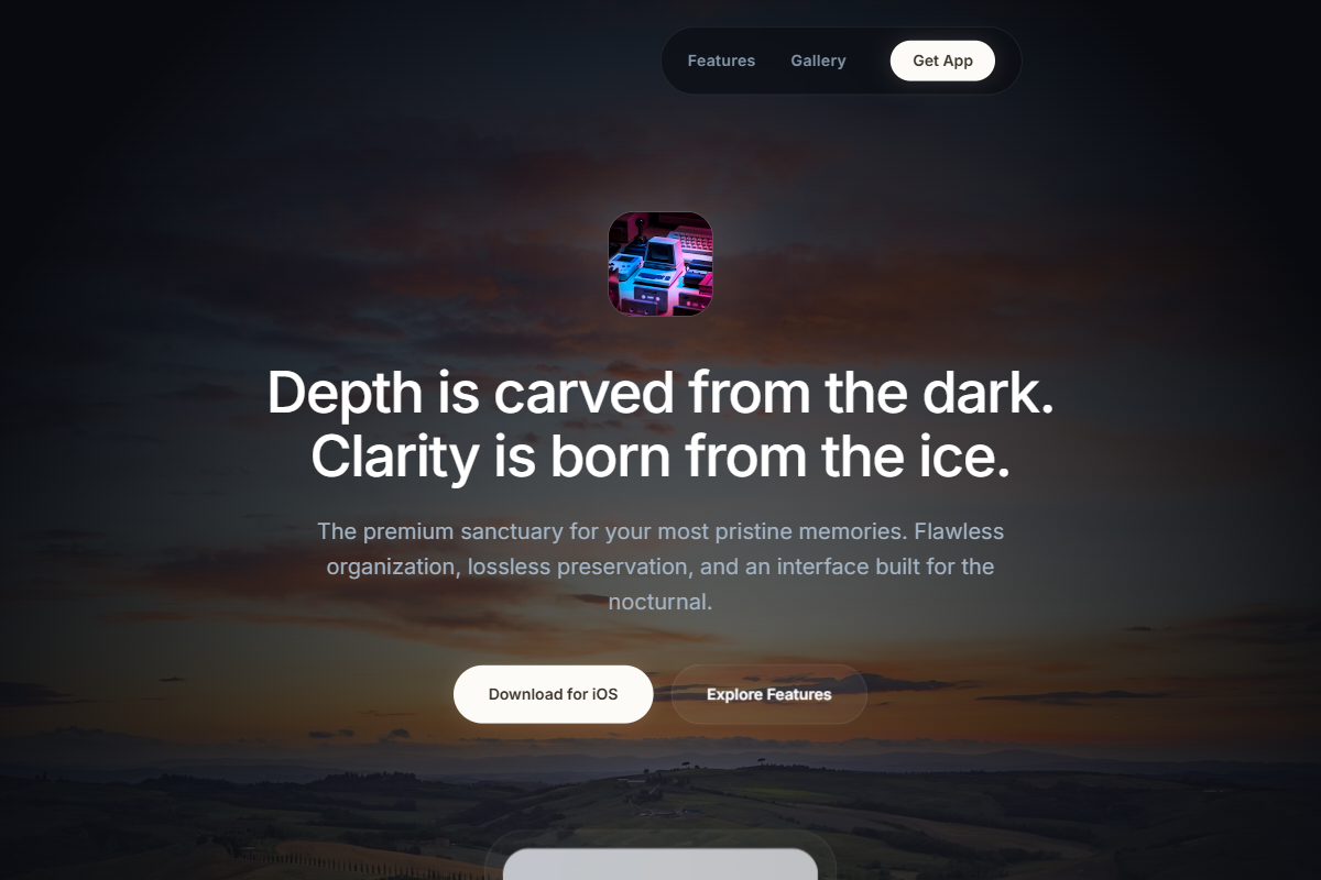
A cool, high-clarity dark aesthetic inspired by frozen landscapes, moonlit water, and refined glassmorphism. Use Helvetica Now, SF Pro Display, or Geist for a precise modern hierarchy: 44–52px centered hero headline, 18–20px paragraph, 14px navigation, and 34–40px feature headings. Build the palette from glacial black, blue-charcoal, mineral slate, ice fog, pearl white, and a faint champagne-snow CTA accent. The hero should use a full-bleed glacier, ocean, waterfall, or cloudscape background with darkened edges, a soft radial glow behind the centered app icon, concise copy, and pill-shaped CTAs. Underneath, create a centered grid or row of mobile mockups on translucent ice-glass cards. Feature modules should feel pristine and architectural, with large rounded visuals, thin silver borders, ample negative space, and a polished dark footer conversion block.
0 likes
0 bookmarks
Jul 10, 2026
Copy Design Aesthetic