Home
Templates
Design Systems
Use Cases
Contact
Back to design aesthetics
Share
Save
Gradient Plinth App Editorial
/gradientPlinthAppEditorial
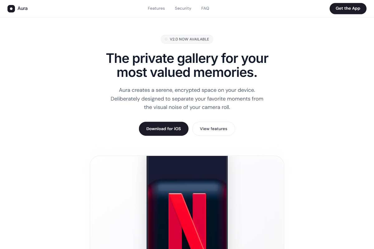
A refined editorial variation that treats screenshots like objects displayed on soft gradient plinths. Use Geist or Helvetica for headings with Roboto or DM Sans for body copy, keeping the typographic scale restrained: 38–42px hero headline, 17–18px paragraph text, compact nav labels, and 32–38px section headings. The base UI should be minimal and light: gallery white, pearl gray, pale stone, cloud lavender, graphite, and blackened-indigo CTA buttons. The hero should use a centered column, slim translucent navbar, short value proposition, pill CTAs, and a phone mockup below the headline. Lower sections should stay mobile-first and vertically composed, with alternating feature blocks where product shots sit inside rounded square gradient stages with generous padding. Use thin borders, soft shadows, bento highlights, and polished FAQ accordions.
0 likes
0 bookmarks
Jul 24, 2026
Copy Design Aesthetic