Home
Templates
Design Systems
Use Cases
Contact
Back to design aesthetics
Share
Save
Ice White Copper Blue Morning Counter
/iceWhiteCopperBlueMorningCounter
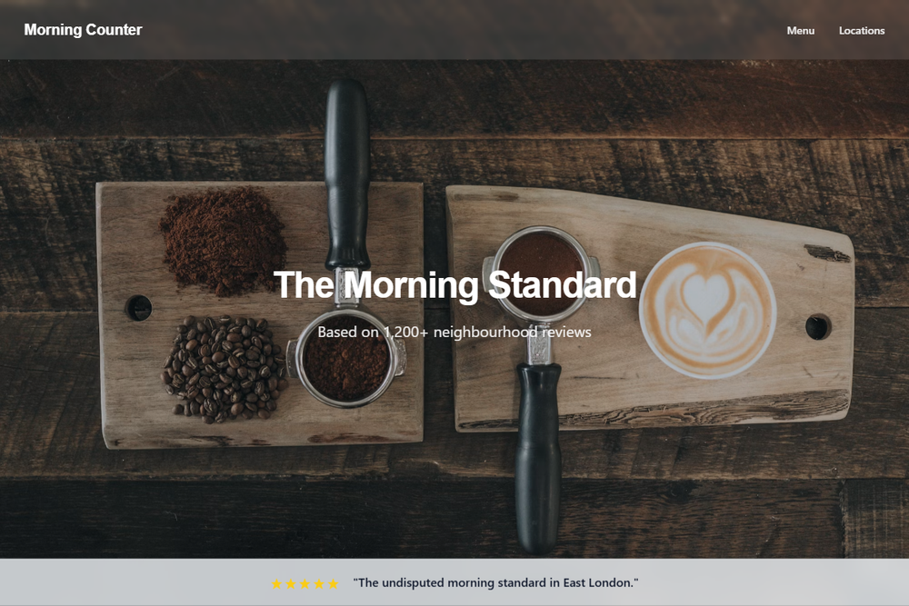
Design philosophy: create a bright, polished morning-counter system using ice-white backgrounds, cool aluminum-gray dividers, and a rare copper-blue accent that feels more curated than corporate. Core beliefs: the page should feel owner-maintained but designed with discipline; social proof, menu clarity, and photography should carry the brand. Strict rules: light navbar, full-height hero with daylight counter or shopfront image, translucent proof strip with golden stars, copper-blue primary button, quiet secondary link, centered headline with review count, alternating content rows, one copper-blue editorial section, background-photo quote panel, HTML-table menu with fine rules, and location blocks with opening details. Typography philosophy: pair Univers-style sans, Avenir Next, or FF Meta with Source Sans 3 or dark DM Sans; avoid theatrical display type. Spacing: generous, modular, maintainable. Motion: button darkening and soft fades. Imagery: steel counters, windows, trays, regular tables. Refuses gradients, icons, badges, beige. Mediocre implementation: cold corporate café page. Common mistakes: weak blue contrast, over-polished stock imagery, inconsistent gutters.
0 likes
0 bookmarks
Aug 21, 2026
Copy Design Aesthetic