Home
Templates
Design Systems
Use Cases
Contact
Back to design aesthetics
Share
Save
Ice White Ink Blue Mirror Gazette
/iceWhiteInkBlueMirrorGazette
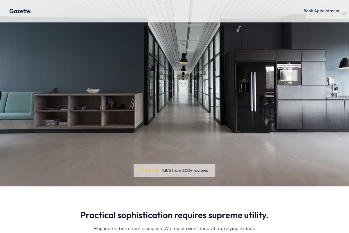
Design philosophy: translate the calm of mirror light, printed price lists, and high-street notices into a cool editorial landing page with ice-white backgrounds, pale blue-gray structure, ink-charcoal type, and a disciplined ink-blue action colour. Core beliefs: sophistication should feel practical; review proof, service clarity, and real photography should carry the identity before decoration appears. Strict rules: light ice navbar, 80vh hero with mirror reflection, doorway, or evening-window image, glass social-proof strip with golden stars, ink-blue CTA, understated booking link, centered headline and review-count section, two image-led feature rows, one ink-blue panel with warm-white text, atmospheric background-image story strip, ruled HTML prices table, and location details separated by hairlines. Typography philosophy: pair FF Meta, Humanist 521, or Myriad Pro with Source Sans 3, Lato, or dark DM Sans. Spacing: editorial but maintainable. Motion: fades only. Imagery: reflective surfaces, chairs, street windows. Refuses glossy luxury black, script logos, beauty icons, beige. Mediocre implementation: cold corporate blue salon. Common mistakes: heavy overlays, oversized headings, weak CTA contrast.
0 likes
0 bookmarks
Aug 22, 2026
Copy Design Aesthetic