Home
Templates
Design Systems
Use Cases
Contact
Back to design aesthetics
Share
Save
Iced Blue Till Paper & Naval Ink Review Ledger
/icedBlueTillPaperNavalInkReviewLedger
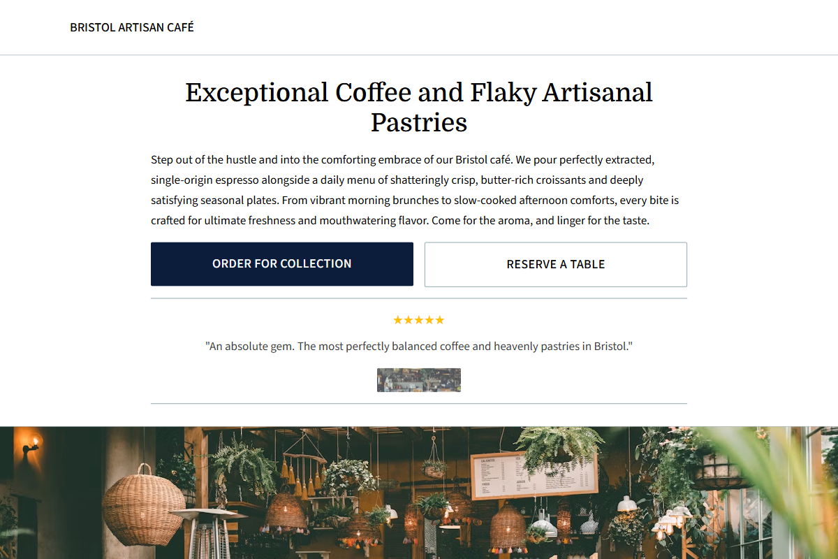
Design philosophy: a cool till-paper aesthetic using w3-white surfaces, icy w3-pale-blue trays, blue-grey borders, soft charcoal body copy, golden yellow stars, and a severe naval-blue accent reserved for decisive actions. Core beliefs: refinement comes from restraint, neat tables, photographic cadence, and typography that feels printed, not branded. Strict rules: light navbar, centered headline with restrained serif weight, brief paragraph, visible social proof, two CTAs, menu/pricing rows with aligned prices, editorial photo band, practical final CTA. Typography philosophy: use Times New Roman, Tinos, or Domine for headings with Open Sans, Cabin, or Source Sans 3 for supporting text; body 17px minimum, generous leading. Spacing philosophy: old website-builder consistency, no showroom gaps, strong left edges in content sections. Motion: slow fades only. Imagery: blue china, receipt rolls, window reflections, white tablecloths, stainless counters. Refuses nautical themes, gradients, avatars, badges, beige warmth. Common mistakes: decorative dividers, weak contrast, generic template navy, over-polished restaurant styling.
0 likes
0 bookmarks
Sep 24, 2026
Copy Design Aesthetic