Home
Templates
Design Systems
Use Cases
Contact
Back to design aesthetics
Share
Save
Ice-Grey Teahouse Index & Burnt Fig Ink
/icegreyTeahouseIndexBurntFigInk
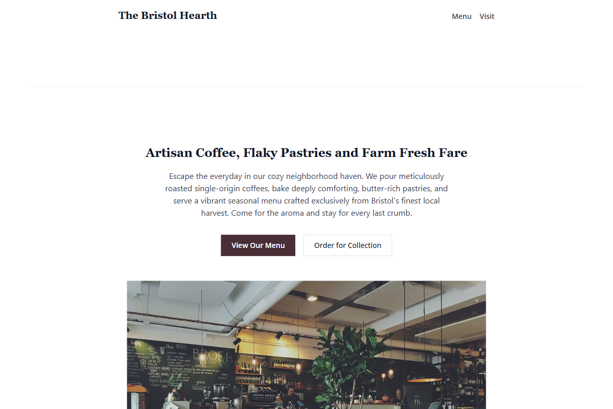
Design philosophy: a crisp light-theme index built from white surfaces, icy grey table-like blocks, graphite-black copy, golden stars, and a burnt-fig ink accent that feels printed rather than branded. Core beliefs: local-business elegance comes from alignment, plain content, and typographic confidence, not decorative café symbolism. Strict rules: MVP.css defaults may remain visible, light nav only, single-column hero, two restrained buttons, narrow content width, ledger rows with hairline dividers, no colored section backgrounds. Typography philosophy: combine Tinos, Cardo, or Libre Baskerville for headings with Lucida Grande, Droid Sans, or Open Sans for body; keep headings medium-sized and slightly formal. Spacing philosophy: practical 2014 cadence, short sections, tidy margins, no showroom gaps. Motion philosophy: static-first with optional slow opacity reveals. Imagery philosophy: glass counters, cake domes, folded menus, rainlit street windows. Refuses icons, badges, ribbons, faux chalkboards, AI florals. Common mistakes: SaaS spacing, generic navy CTAs, tiny captions, ornamental dividers.
0 likes
0 bookmarks
Oct 3, 2026
Copy Design Aesthetic