Home
Templates
Design Systems
Use Cases
Contact
Back to design aesthetics
Share
Save
Ink Blue Lunchtime Ledger
/inkBlueLunchtimeLedger
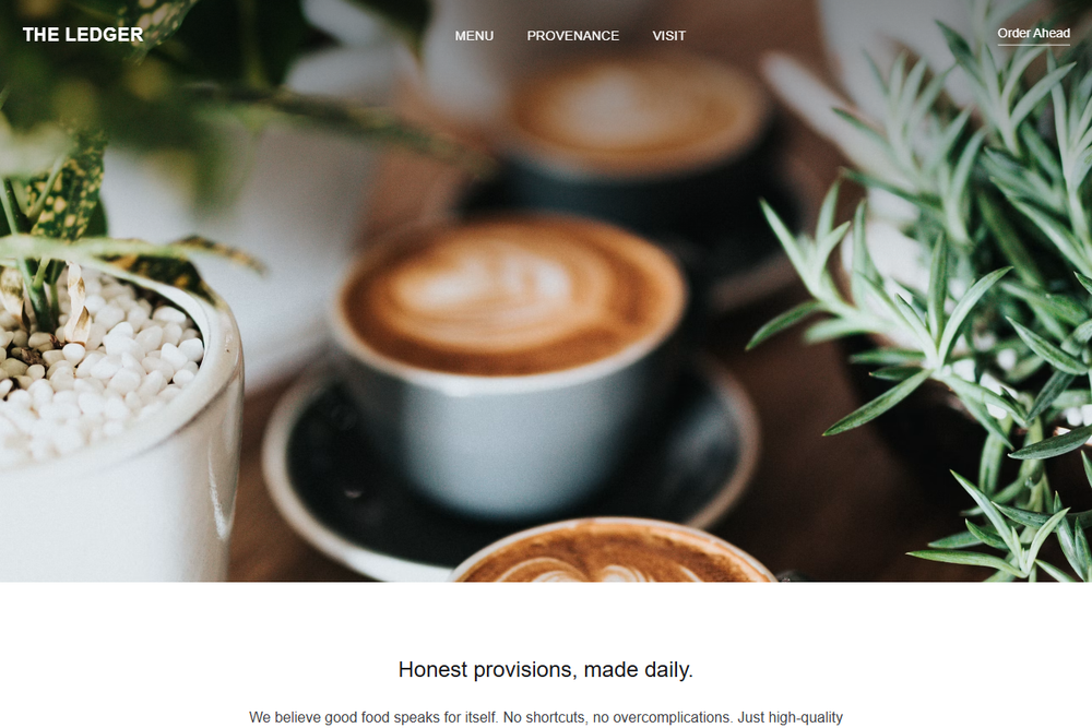
Design philosophy: design a dependable café landing page that feels like a printed lunch menu translated into a smart, slightly old-web layout. Core beliefs: the best small-business pages are direct, well-spaced, and information-rich without looking corporate. Strict rules: light navbar, 80vh hero image with restrained overlay, ink-blue primary CTA, understated text link, centered headline and paragraph below, compact owner-note social proof, two practical feature sections, one ink-blue background section with light text, a background-photo quote or provenance strip, menu as a ledger with fine rules and aligned prices, and an unmistakable location section. Typography philosophy: use News Gothic, Benton Sans, Gill Sans Nova, or Noto Sans; clear sans hierarchy with modest headline scale. Palette: white, blue-gray, pale slate, ink blue, charcoal, small tomato-red accent. Spacing: steady, slightly builder-like, never sterile. Motion: hover darkening and simple fades. Imagery: sandwiches, pastry trays, till counter, street frontage. Refuses SaaS cards, gradients, avatars, beige. Mediocre implementation: flat navy corporate page. Common mistakes: heavy overlays, oversized hero copy, inconsistent price alignment.
0 likes
0 bookmarks
Aug 21, 2026
Copy Design Aesthetic