Home
Templates
Design Systems
Use Cases
Contact
Back to design aesthetics
Share
Save
Lemon Cream Counter Editorial
/lemonCreamCounterEditorial
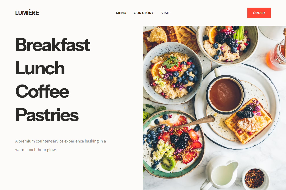
A sprightly, image-led restaurant aesthetic with a polished counter-service energy and a warm lunch-hour glow. Pair Instrument Sans for headings and UI with Source Sans 3 for relaxed body text, keeping the typography clean, legible, and highly reusable. Hero headings should sit around 68–76px with tight line-height, while paragraphs remain 17–18px and airy. The layout opens with immersive full-bleed photography and left-side branding, drops into a centered menu section, then alternates between edge-to-edge image panels and centered editorial copy blocks on lemon-cream and pale stone backgrounds. The split layout uses large typographic navigation on the left and a dominant food image on the right. Palette: milk white, lemon cream, pale stone, soft black, and a vivid tomato-red CTA accent.
0 likes
0 bookmarks
Jul 27, 2026
Copy Design Aesthetic