Home
Templates
Design Systems
Use Cases
Contact
Back to design aesthetics
Share
Save
Limestone Studio App Gallery
/limestoneStudioAppGallery
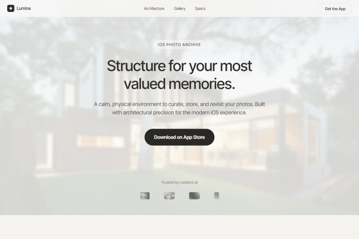
A warm, architectural light aesthetic that feels like a premium product studio: calm, structured, and highly reusable. Use Helvetica Now, Geist, or Inter Tight with precise sizing: 42–50px hero headline, 18px body copy, 13–14px navigation, and 34–40px feature headings. Keep the palette grounded in limestone, pearl white, pale concrete, warm fog, graphite, smoked espresso, and dark umber-charcoal for rounded CTAs. The hero should use a full-height photographic backdrop—soft landscape, natural stone, quiet workspace, or lifestyle detail—with a translucent ivory overlay and centered conversion stack. Device previews should sit underneath in a clean, evenly spaced grid with frosted cards and faint inner strokes. Lower sections should feel modular: stacked pale-gray panels, right-side imagery, left-side concise copy, rounded screenshots, restrained icon tiles, and quiet accordion modules.
0 likes
0 bookmarks
Jul 10, 2026
Copy Design Aesthetic