Home
Templates
Design Systems
Use Cases
Contact
Back to design aesthetics
Share
Save
Milk-Glass Juniper Ink & Vermouth-Red Appointment Card
/milkglassJuniperInkVermouthredAppointmentCard
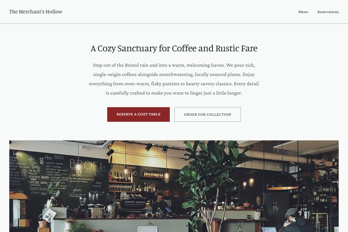
Design philosophy: a cool appointment-card aesthetic using milk-glass white surfaces, pale juniper-grey panels, green-black text, graphite-green hairlines, golden yellow review stars, and dry vermouth-red reserved for CTAs and selected states. Core beliefs: beauty comes from useful structure, honest images, restrained colour, and type that feels chosen rather than default. Strict rules: light navbar, centered hero with 3xl maximum display heading, concise description, CTAs, wide image below, one-column menu with calm dividers, 80%-width two-column image grid on a juniper field, direct CTA, and simple footer. Typography philosophy: combine Trykker, Manuale, or Halant headings with Domine, Crimson Pro, or Merriweather body at generous leading. Spacing: old-builder consistency, medium gutters, compact but breathable section rhythm. Motion: slow fades and fine underline hovers. Imagery: green glass, black leather notebook, silver spoons, rainy pavement, written reservations. Refuses foliage decoration, beige warmth, badges, avatars, SaaS polish. Common mistakes: generic sage, low contrast, bright red, crowded menu copy.
0 likes
0 bookmarks
Sep 20, 2026
Copy Design Aesthetic