Home
Templates
Design Systems
Use Cases
Contact
Back to design aesthetics
Share
Save
Milk-White Counter Sheets & Soft-Black Receipt Ink
/milkwhiteCounterSheetsSoftblackReceiptInk
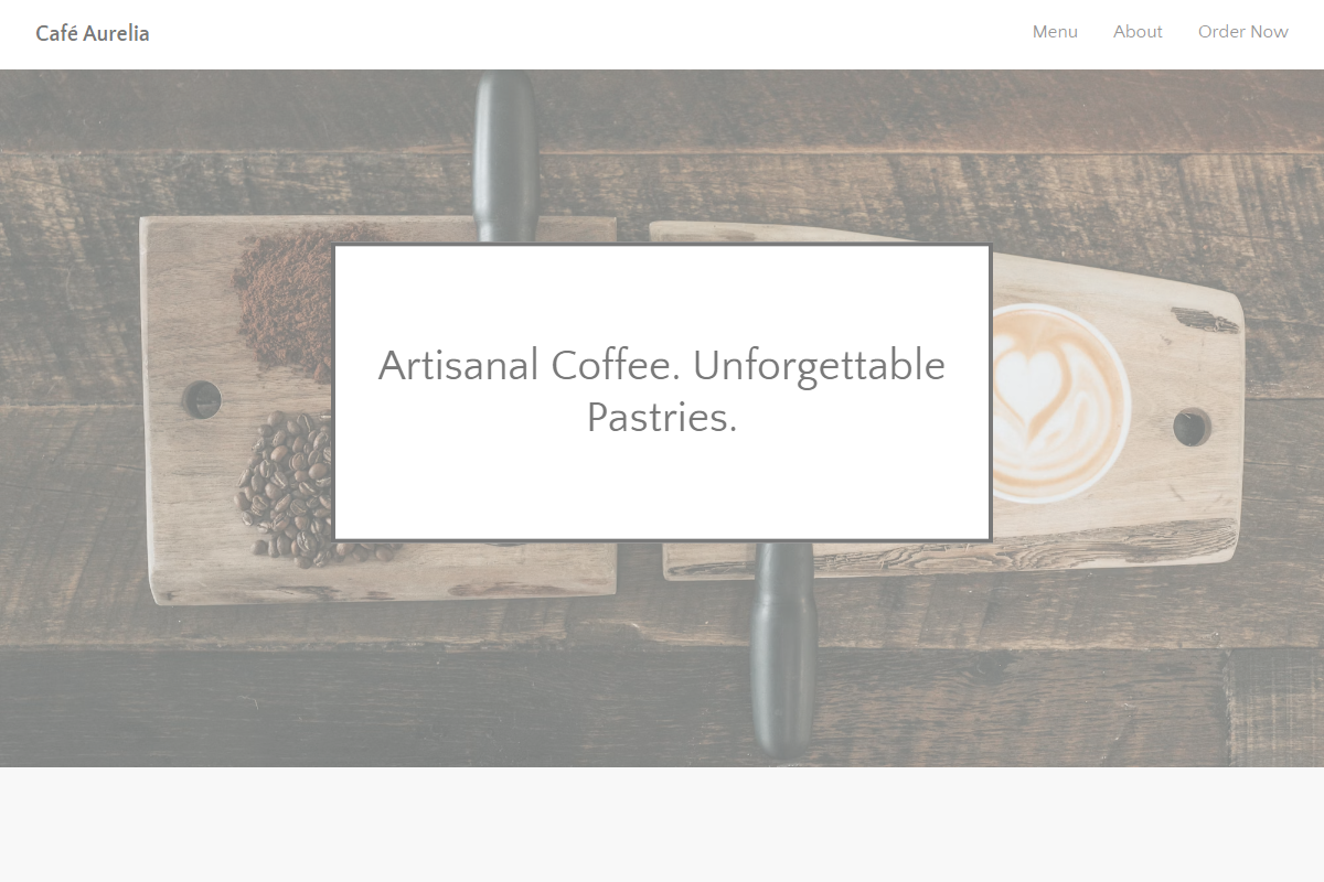
Design philosophy: a visually close-family café landing page system built like a clean owner-editable document: white full-width sheets, w3-light-grey section trays, soft-black typography, golden yellow review stars, and squared black CTAs that feel printed rather than styled. Core beliefs: readability, maintainability, repeatable sections, and image confidence create trust. Strict rules: sticky light navbar, 100% width, no coloured backgrounds beyond pale grey, no badges, avatars, gradients, icons, or rounded SaaS cards. Typography philosophy: Quattrocentro Sans throughout; 2.4–2.8rem hero, 20px bold document intro, 17px body, compact FAQ headings. Spacing philosophy: practical 2021 website-builder rhythm with visible section joins and medium gutters. Motion: soft fades only. Imagery: cups, tiled counters, window reflections, printed menus. Refuses beige warmth and startup polish. Common mistakes: weak grey contrast, oversized hero type, generic black buttons.
0 likes
0 bookmarks
Oct 15, 2026
Copy Design Aesthetic