Home
Templates
Design Systems
Use Cases
Contact
Back to design aesthetics
Share
Save
Milk-White Delft Ink & Sea-Blue Menu Gazette
/milkwhiteDelftInkSeablueMenuGazette
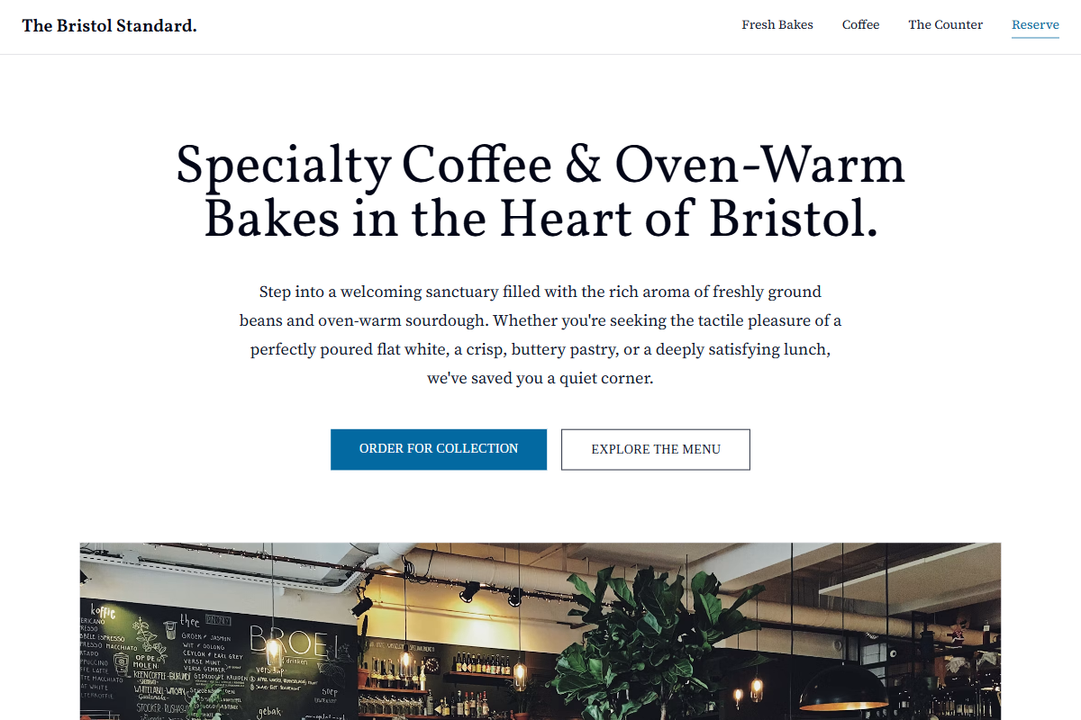
Design philosophy: a crisp local gazette-inspired system using milk-white pages, pale cool-grey modules, Delft-ink typography, fine zinc dividers, golden yellow review stars, and a restrained sea-blue accent reserved for CTAs, active nav, and one proof sentence. Core beliefs: every section should feel editable, readable, and intentionally placed, as if adapted from a printed notice sheet rather than a SaaS component library. Strict rules: light horizontal navbar, image-heavy hero with classic serif claim, visible review stars, centered credibility block, alternating image/text panels, HTML-table-inspired menu with ruled rows, and a practical map/location footer. Typography philosophy: combine Goudy Bookletter 1911, Tinos, or Vollkorn headings with Libre Baskerville or Source Serif 4 body; avoid trendy geometric sans defaults. Spacing: baseline-led, medium gutters, consistent row heights. Motion: soft reveals and hover darkening only. Imagery: counter corners, china, paper ephemera, street glass. Refuses badges, avatars, beige, chalkboard nostalgia. Common mistakes: generic teal, cramped tables, fake boutique luxury, weak body contrast.
0 likes
0 bookmarks
Sep 15, 2026
Copy Design Aesthetic