Home
Templates
Design Systems
Use Cases
Contact
Back to design aesthetics
Share
Save
Milk-White Newspaper & Cranberry Till Mark
/milkwhiteNewspaperCranberryTillMark
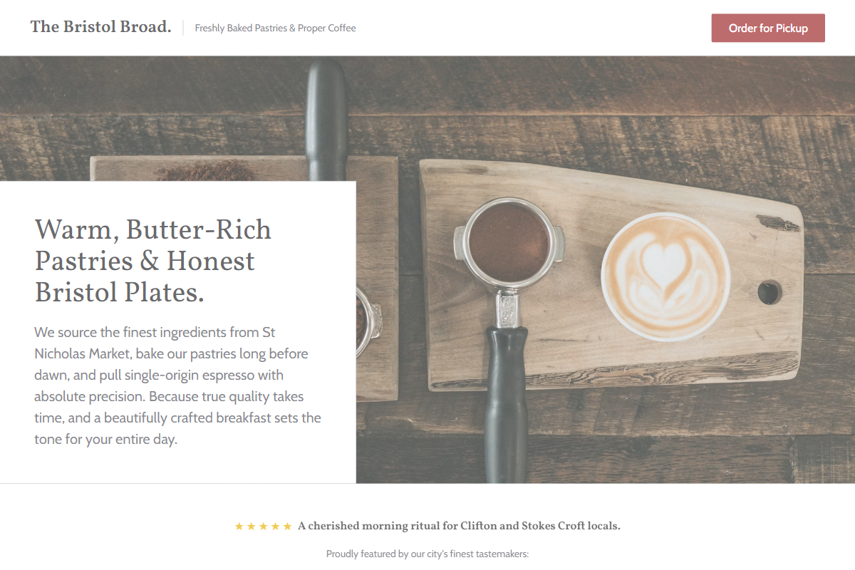
Design philosophy: an editorial local-business sheet using milk-white backgrounds, pale newspaper-grey modules, pencil dividers, deep graphite text, golden yellow stars, and a dry cranberry-red accent applied like a till stamp rather than a brand flourish. Core beliefs: the page should feel printed, useful, lightly handmade, and calm. Strict rules: Bootstrap light navbar, centered headline capped at 3xl, concise intro, two restrained CTAs, wide photo panel, listings-style menu rows, one proof line, direct contact strip. Typography philosophy: use Vollkorn, Alegreya, or Source Serif 4 headings with Lucida Grande, Cabin, or Noto Sans body; keep hierarchy modest and legible. Spacing philosophy: narrow sections, repeatable padding, visible baselines. Motion: slow fades only. Imagery: folded papers, counter glass, cups, receipt rolls, street-facing windows. Refuses beige paper, retro distress, stickers, icons, app cards. Common mistakes: candy red, cluttered reviews, faux-vintage ornament.
0 likes
0 bookmarks
Sep 24, 2026
Copy Design Aesthetic