Home
Templates
Design Systems
Use Cases
Contact
Back to design aesthetics
Share
Save
Milk-White Newsprint & Ink-Navy Café Index
/milkwhiteNewsprintInknavyCafIndex
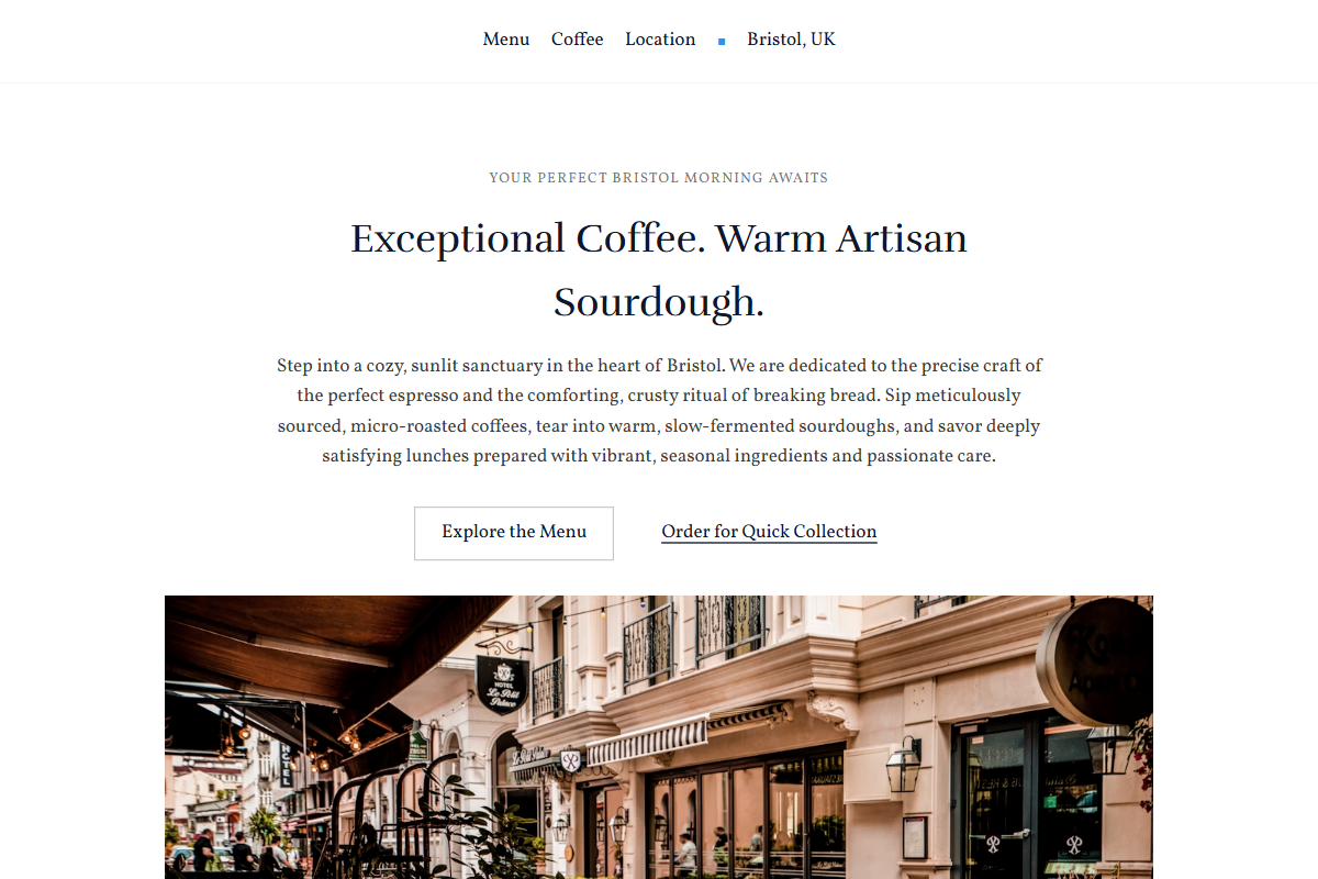
Design philosophy: an editorial café index using milk-white pages, w3-sand avoided entirely in favour of w3-white and w3-light-grey, soft newspaper-grey blocks, ink-navy headings, pencil-grey rules, golden yellow review stars, and a dark w3-blue accent treated like a modest typesetter’s mark. Core beliefs: the design should feel readable, photographic, edited, and slightly handmade without becoming decorative. Strict rules: light navbar, centered serif hero capped at 3xl, short description, paired CTAs, wide image below, one-column menu like a listings page, 80%-width image grid on grey newsprint ground, simple CTA, quiet footer. Typography philosophy: combine Rufina, Forum, or Bellefair headings with Vollkorn, Lusitana, or Alegreya body at 17–18px. Spacing: compact 2014 rhythm, consistent section widths, tidy gutters, steady menu row height. Motion: fades only; no parallax. Imagery: folded menus, cups, till receipts, street-facing windows. Refuses AI doodles, beige paper, icons, cards, badges. Common mistakes: generic template navy, weak greys, oversized headings, decorative clutter.
0 likes
0 bookmarks
Sep 24, 2026
Copy Design Aesthetic