Home
Templates
Design Systems
Use Cases
Contact
Back to design aesthetics
Share
Save
Milk-White Teal Village Review Sheet
/milkwhiteTealVillageReviewSheet
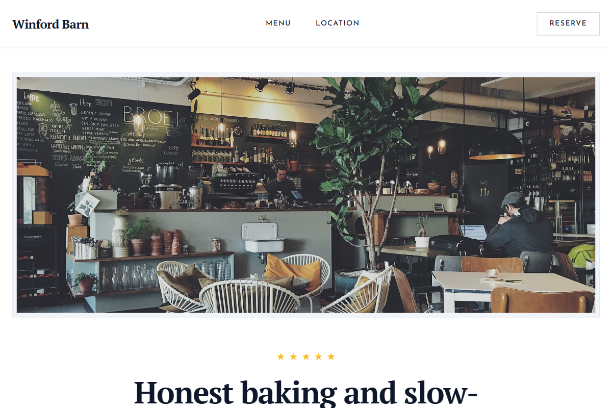
Design philosophy: a restrained 2016-style local-business page with milk-white surfaces, pale pewter rules, charcoal copy, golden review stars, and a deep teal booking accent used only for decisive actions. Core beliefs: authenticity comes from visible information, real room photography, review proof, and typography that feels owner-maintained but carefully art-directed. Strict rules: light navbar, tall hero with countryside table/window photography, star rating beside CTA, centered proof-led headline, ruled HTML-style menu, one teal notice panel, and practical location columns. Typography philosophy: pair Times New Roman, Georgia Pro, or Plantin with Josefin Sans or Gill Sans for labels. Spacing: tidy, modular, slightly old website-builder. Motion: fades and underline hovers only. Imagery: teacups, village glass, printed menus. Refuses badges, avatars, icons, beige, polish-heavy luxury. Mediocre implementation: generic teal café brochure. Common mistakes: overusing teal, cramped menu rows, weak serif hierarchy.
0 likes
0 bookmarks
Aug 24, 2026
Copy Design Aesthetic