Home
Templates
Design Systems
Use Cases
Contact
Back to design aesthetics
Share
Save
Mist Blue Bakery Bulletin
/mistBlueBakeryBulletin
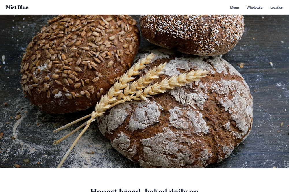
Design philosophy: translate a small high-street bakery bulletin into a polished landing page with calm rhythm and practical charm. Core beliefs: the page should look easy for an owner to update; hierarchy comes from section order, type scale, ruled lists, and honest photography. Strict rules: light navbar, 80vh full-width hero with soft daylight bakery imagery, mist-blue primary CTA, quiet menu link, centered headline and paragraph underneath, two image-led feature bands, one accent-background feature in mist blue with white text, menu grouped by category, and a location block with hours, address, phone, and map link. Typography philosophy: pair Besley, Bitter, or Charter with Rubik, IBM Plex Sans, or Assistant; avoid fashionable extremes. Palette: snow white, mist blue, pale steel gray, deep navy ink, soft charcoal, restrained raspberry note. Spacing: steady vertical pauses, readable line lengths, no card grids. Motion: simple fades and underline hovers. Imagery: bread trays, window light, cups, exterior frontage. Refuses SaaS cards, stickers, badges, testimonials, beige. Mediocre implementation: bland baby-blue template. Common mistakes: pastel low contrast, over-centering, oversized hero copy.
0 likes
0 bookmarks
Aug 21, 2026
Copy Design Aesthetic