Home
Templates
Design Systems
Use Cases
Contact
Back to design aesthetics
Share
Save
Moonlit Gradient App Corridor
/moonlitGradientAppCorridor
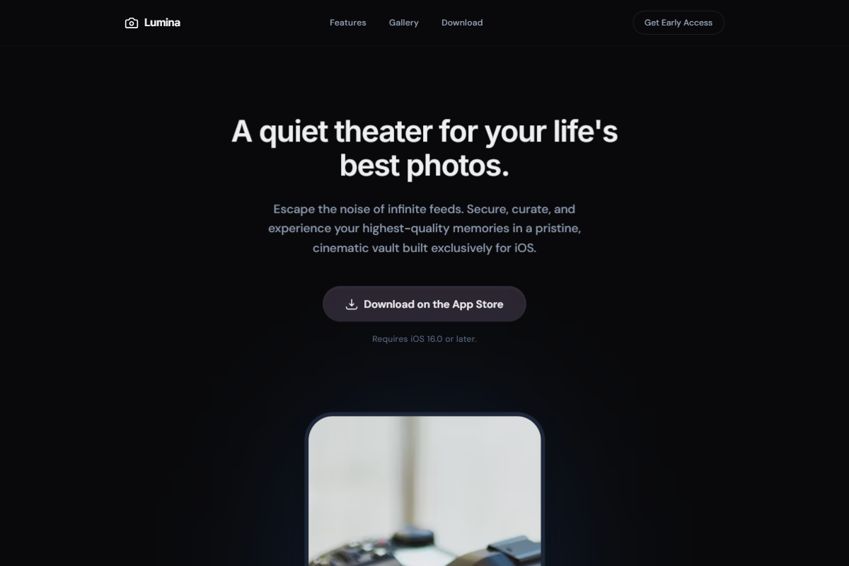
A polished dark-theme direction that feels like a premium app launch viewed through a calm cinematic corridor. Use Inter for crisp, restrained headings paired with Satoshi or DM Sans for supporting text, with a centered 38–42px hero headline, 17px body copy, small nav typography, and confident 34px section titles. The palette should combine midnight graphite, ink navy, muted violet, silver mist, moon white, and monochrome plum-charcoal CTAs. Keep the desktop layout mobile-first: narrow centered containers, vertical pacing, rounded buttons, and a phone mockup staged below the hero. Use bright blue, magenta, and violet gradients only as padded screenshot backplates in feature and bento sections. Add alternating feature rows, soft glass panels, thin luminous dividers, scroll-depth fade-ins, and a full-bleed nature image section darkened with a translucent overlay.
0 likes
0 bookmarks
Jul 24, 2026
Copy Design Aesthetic