Home
Templates
Design Systems
Use Cases
Contact
Back to design aesthetics
Share
Save
Moonlit Startup Glass Minimalism
/moonlitStartupGlassMinimalism
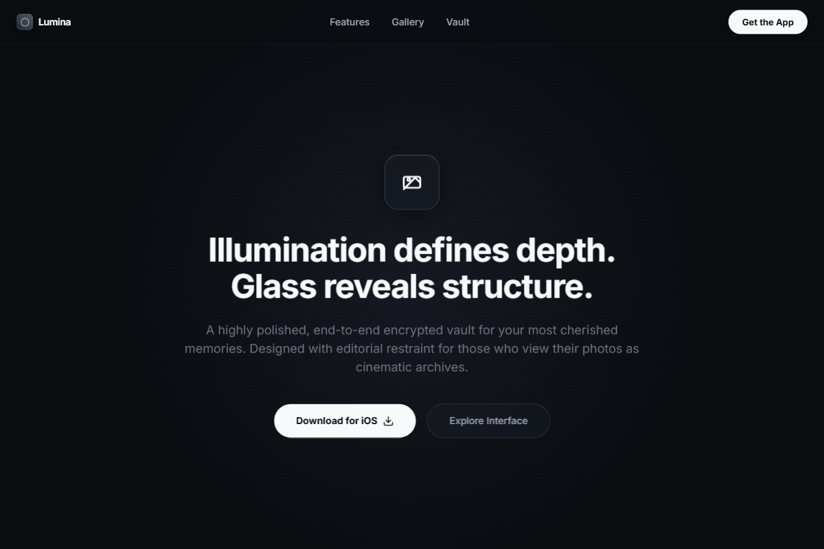
A darker, more atmospheric exploration that combines classic app-launch structure with moonlit glassmorphism and editorial restraint. Use Inter, Söhne, or Helvetica Neue with bold but compact sizing: 40–48px hero heading, 18px paragraph text, 13–14px labels, and 34–38px section titles. The palette should combine lunar black, blue-charcoal, fog gray, matte silver, and bone-white CTA accents. The hero should occupy the full viewport with a cinematic background image, subtle radial illumination, centered app icon, centered text stack, and fully rounded primary/secondary buttons. Add a screenshot row beneath using frosted glass tiles, soft reflections, and minimal captions. Continue with alternating feature sections: large rounded interface imagery on one side, clear heading and paragraph on the other, thin dividers, restrained glow edges, and a polished final CTA block.
0 likes
0 bookmarks
Jul 10, 2026
Copy Design Aesthetic