Home
Templates
Design Systems
Use Cases
Contact
Back to design aesthetics
Share
Save
Oat Milk Interface Calm
/oatMilkInterfaceCalm
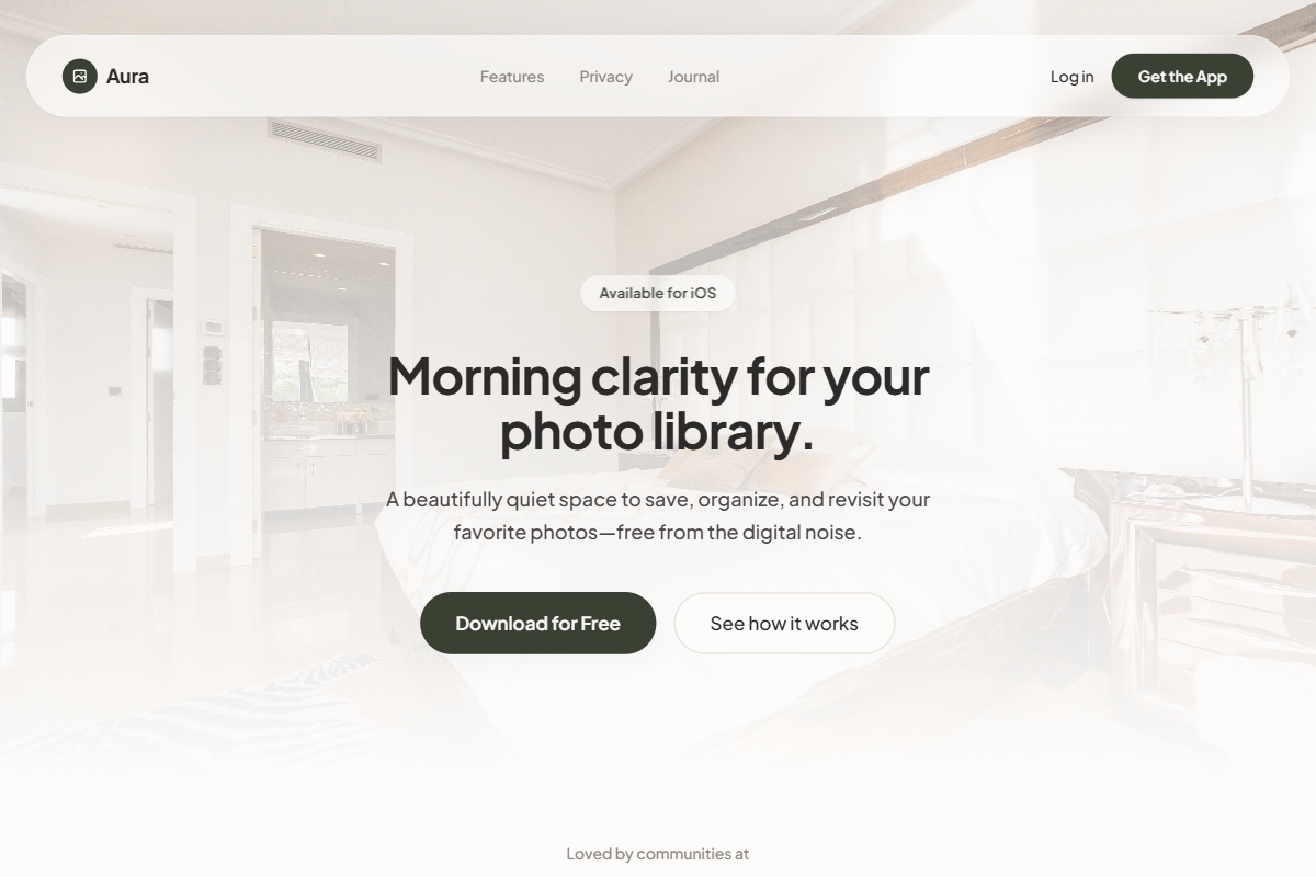
A warm, friendly light-theme design system with soft glassmorphism, rounded geometry, and a refined consumer-grade feel. Use DM Sans, Manrope, or Plus Jakarta Sans with a balanced hierarchy: 40–46px hero headline, 17–18px supporting copy, 13–14px nav text, and 32–36px section titles. The palette should combine oat milk, warm white, pale stone, mushroom gray, soft graphite, and dark roasted-olive CTAs instead of generic black. The hero should feature a bright full-bleed photograph—morning workspace, café table, home interior, travel scene, or calm natural setting—with a centered conversion stack and fully rounded buttons. Below, use a spacious device mockup grid in frosted cards with subtle inner strokes. Feature sections should remain vertically centered, pairing left-aligned copy with right-side rounded imagery, gentle shadows, glass labels, clean icon cards, and airy FAQ accordions.
0 likes
0 bookmarks
Jul 10, 2026
Copy Design Aesthetic