Home
Templates
Design Systems
Use Cases
Contact
Back to design aesthetics
Share
Save
Obsidian Pearl App Gallery
/obsidianPearlAppGallery
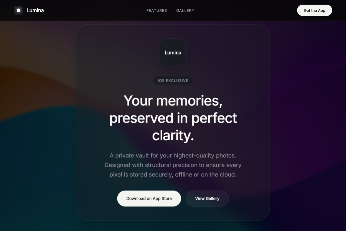
A visually close dark app-launch aesthetic built for maximum reuse, with monochrome discipline, soft glass layers, and a luminous off-white CTA system. Use Inter, Helvetica Neue, or SF Pro with a tight hierarchy: 42–48px centered hero heading, 18–20px paragraph, 13–14px labels, and 34–38px section titles. The palette should combine obsidian black, blue-charcoal, graphite, smoke gray, pearl white, and warm alabaster for fully rounded primary buttons. The hero should be full-bleed and full-height, using a cinematic product or lifestyle image with a dark overlay, centered translucent glass container, app icon, headline, copy, and pill CTAs. Follow with a clean row of mobile mockups in frosted glass cards, then alternate feature sections with image-right/copy-left layouts, soft borders, rounded screenshots, and precise Framer-level spacing.
0 likes
0 bookmarks
Jul 10, 2026
Copy Design Aesthetic