Home
Templates
Design Systems
Use Cases
Contact
Back to design aesthetics
Share
Save
Opal Smoke Black-Satin & Vermilion Schedule Card
/opalSmokeBlacksatinVermilionScheduleCard
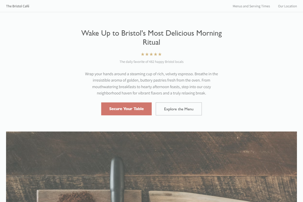
Design philosophy: a polished but old-builder schedule aesthetic using opal-white surfaces, pale smoke-grey cards, black-satin ink, graphite hairlines, golden review stars, and a dry vermilion accent reserved for bookings and selected active states. Core beliefs: sophistication should feel practical and owner-editable, like a full calendar rendered with excellent typographic discipline. Strict rules: slim light navbar, split photo hero, sans hero claim no larger than 3xl, stars immediately under the claim, centered review-count proof, image-heavy editorial sections, table-like menu rows, and unembellished address details. Typography philosophy: use Gill Sans Nova-style, Myriad Pro, or Humanist 521-style headings with Karla, Assistant, or Fira Sans body; keep body generous and readable. Spacing: medium gutters, disciplined row spacing, no showroom emptiness. Motion: slow fades, mild image lift, fine underline hovers. Imagery: leather diary corners, red lipstick, folded menus, wet pavement. Refuses avatars, badges, gradients, beige, generic icons. Common mistakes: bright scarlet buttons, over-polished stock, luxury emptiness, inconsistent table alignment.
0 likes
0 bookmarks
Sep 18, 2026
Copy Design Aesthetic