Home
Templates
Design Systems
Use Cases
Contact
Back to design aesthetics
Share
Save
Paper White Petrol Breakfast Board
/paperWhitePetrolBreakfastBoard
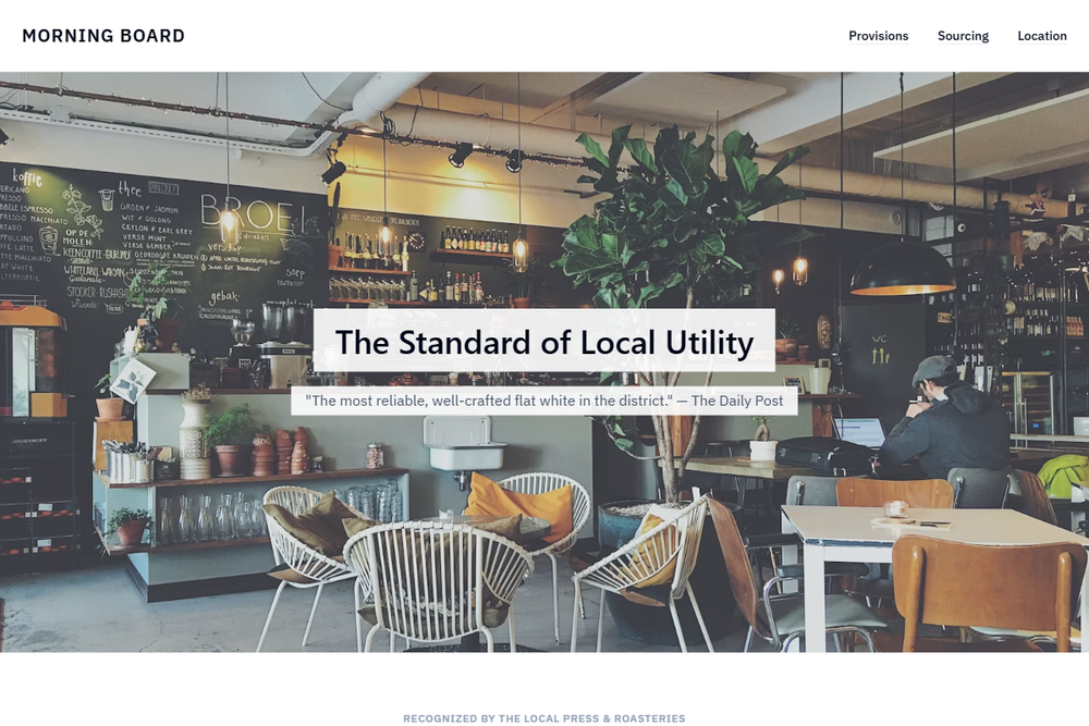
Design philosophy: create a confident café landing page that feels like a carefully typed breakfast board translated into a durable web template. Core beliefs: local charm should come from section rhythm, plainspoken copy, and useful details rather than illustration or decoration. Strict rules: light navbar, 80vh hero with exterior signage or window seating, deep-petrol CTA, simple secondary menu link, centered headline with short review proof beneath, two practical feature sections, one petrol background block with pale text, a photographic overlay strip for founder story or provenance, document-like menu using rules and columns, and clear location/hours/contact. Typography philosophy: use Graphik, Gill Sans Nova, or Frutiger for headings with IBM Plex Sans or Source Sans 3 for body; compact labels, no novelty café lettering. Palette: paper white, pale blue-gray, cool slate, petrol, ink black, tiny coral accent. Spacing: generous but builder-familiar. Motion: underline hovers, opacity fades. Refuses SaaS cards, icon grids, beige. Mediocre implementation: corporate teal restaurant template. Common mistakes: over-centering, low-contrast petrol, oversized hero type.
0 likes
0 bookmarks
Aug 21, 2026
Copy Design Aesthetic