Home
Templates
Design Systems
Aesthetics
Contact
Back to design aesthetics
Share
Save
Pearl App Chronicle Column
/pearlAppChronicleColumn
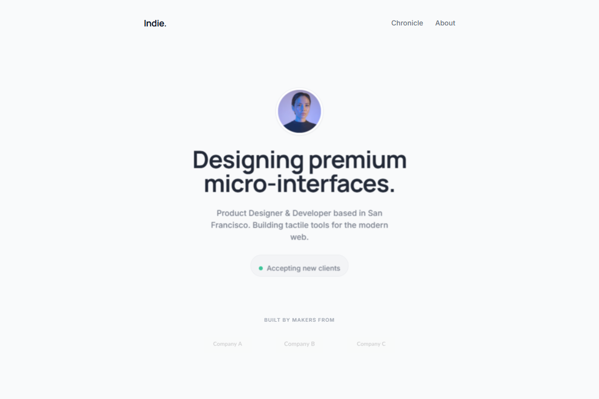
A visually close light-theme aesthetic built around a centered mobile-first column, avatar-led hero, and one project card per row. Use pearl white, chalk gray, warm ivory, graphite text, and muted slate copy, keeping accent color limited to tiny status dots, app icons, or micro badges. Pair bold Manrope, Geist, or Plus Jakarta Sans hero headings with Inter or DM Sans for compact descriptions and metadata. CTAs should be fully rounded graphite capsules with subtle inner highlights, not colorful generic buttons. Project cards should feel like premium iOS case-study widgets with rounded screenshots, launch notes, category chips, short metrics, testimonial snippets, stack labels, delicate borders, soft shadows, and generous Framer-level spacing.
0 likes
0 bookmarks
Jun 18, 2026
Copy Design Aesthetic