Home
Templates
Design Systems
Use Cases
Contact
Back to design aesthetics
Share
Save
Pearl Frame App Launch
/pearlFrameAppLaunch
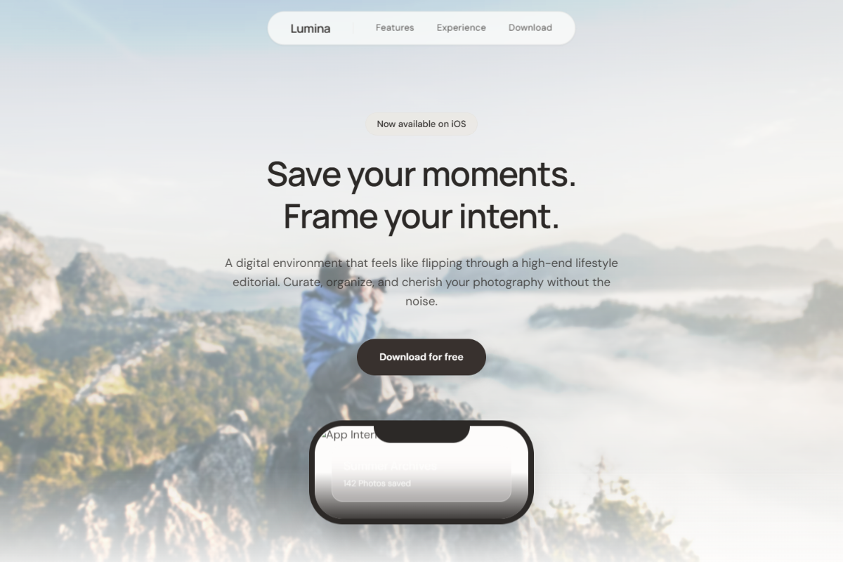
A polished light-theme aesthetic in the same design family, built around a full-viewport photographic hero, centered conversion stack, and a clean phone mockup reveal beneath the copy. Use Manrope Semibold for headings and DM Sans for body text: 36–42px hero headline, 17–18px paragraph, 13–14px nav labels, and 32–38px section headings. Keep the palette refined with pearl white, soft ash gray, warm porcelain, pale limestone, graphite, and deep charcoal-brown CTAs. The hero should use a crisp lifestyle, workspace, travel, wellness, or product-context image with a subtle ivory readability veil, slim glass navbar, compact headline, description, and pill buttons. Lower sections should use off-white rounded panels, alternating feature layouts, phone mockups, muted glass cards, a balanced feature grid, and spacious FAQ accordions.
0 likes
0 bookmarks
Jul 10, 2026
Copy Design Aesthetic