Home
Templates
Design Systems
Use Cases
Contact
Back to design aesthetics
Share
Save
Pearl Grey Parlour & Aubergine Ink Showcase Cards
/pearlGreyParlourAubergineInkShowcaseCards
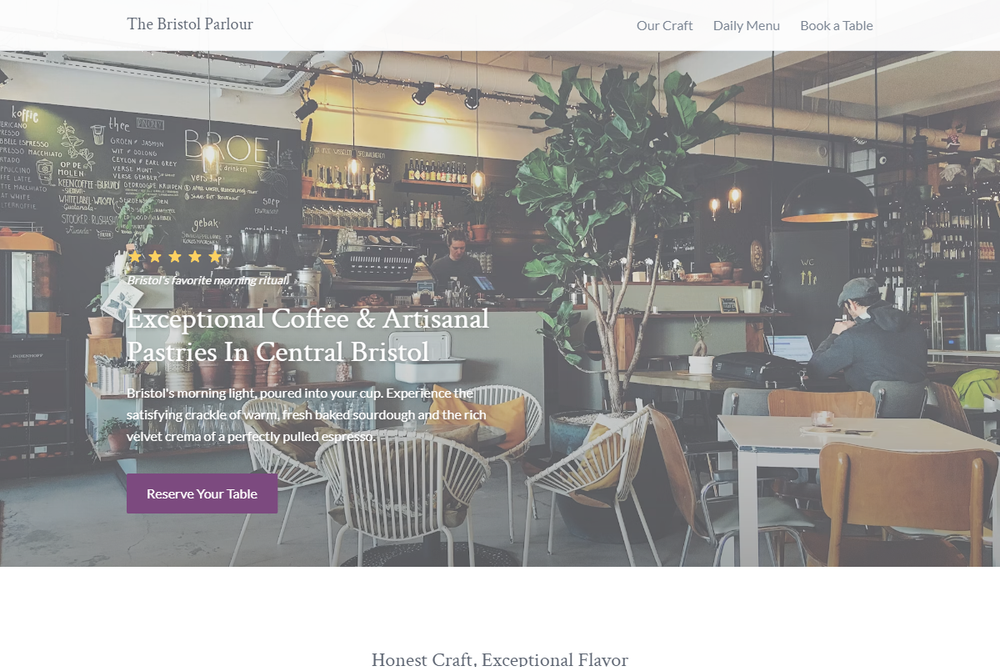
Design philosophy: a refined card-led parlour layout built from white backgrounds, pearl-grey raised modules, pencil-thin dividers, soft graphite typography, golden stars, and near-black aubergine ink for decisive actions only. Core beliefs: a world-class small-business page can still feel owner-built when the grid, typography, and content blocks are disciplined. Strict rules: light navbar, 80% centered layout, serif hero capped at medium-large, concise paragraph, two understated CTAs, image-led card sections, plain service rows, practical contact/footer area. Typography philosophy: combine Rosarivo, Crimson Text, or Charter-style headings with Lato, Karla, or Montserrat; body text stays readable, never tiny. Spacing philosophy: symmetrical card padding, modest vertical rhythm, no decorative fillers. Motion: quiet fades and link darkening. Imagery: porcelain plates, polished forks, window light, floral arrangements only inside photos. Refuses perfume styling, beige, gradients, badges, AI café motifs. Common mistakes: luxury over-polish, purple overload, weak greys, excessive whitespace.
0 likes
0 bookmarks
Sep 27, 2026
Copy Design Aesthetic