Home
Templates
Design Systems
Use Cases
Contact
Back to design aesthetics
Share
Save
Pearl Sheet Café Archive & Cranberry Till Marks
/pearlSheetCafArchiveCranberryTillMarks
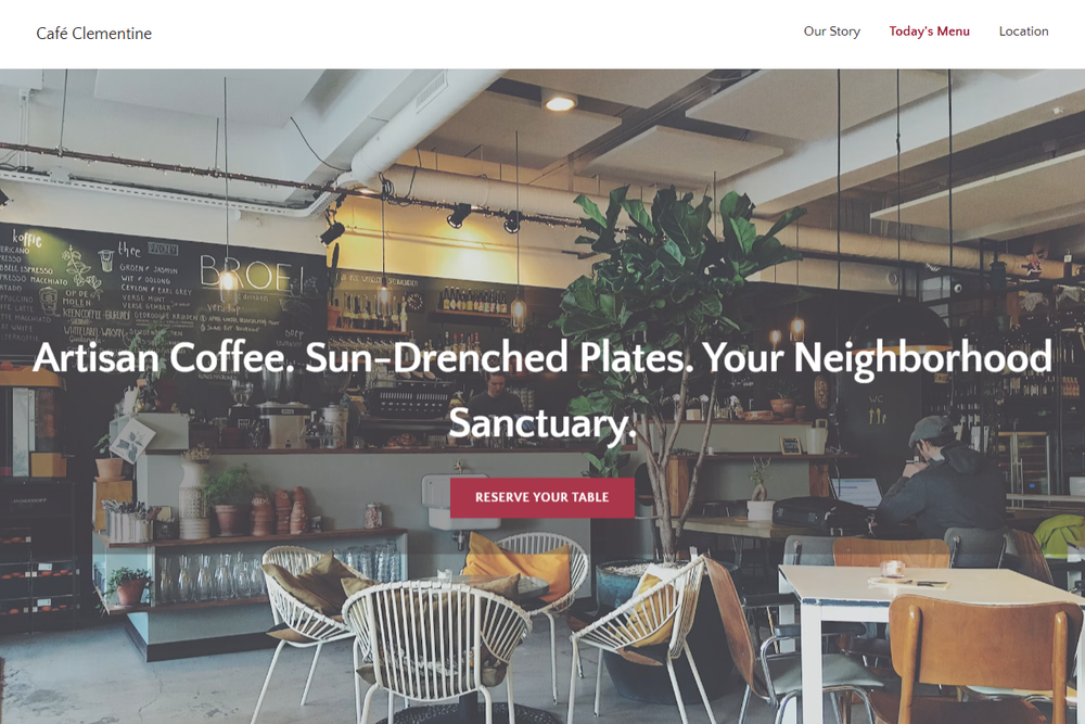
Design philosophy: a document-led W3.css landing page aesthetic with the feeling of archived café menus and booking sheets: pearl-white backgrounds, pale smoke-grey blocks, deep plum-charcoal text, golden yellow stars, and cranberry-red accents used only for CTAs, active links, and tiny rules. Core beliefs: restraint, legibility, repeatable content rows, and strong photography create trust without needing decoration. Strict rules: sticky light navbar, 100% width, white/light-grey only, flat rectangular buttons, one-column menu ledgers, no badges, no avatars, no stickers, no glossy shadows. Typography philosophy: Quattrocentro Sans for all text; headings in SemiBold with tight tracking, body in regular weight with warm charcoal-plum colour, FAQ headings slightly heavier. Spacing philosophy: compact 2021 builder layout with document-style intro directly under hero. Motion: soft opacity reveals only. Imagery: white crockery, dark coats, menu paper, rainlit shopfronts. Refuses beige, script fonts, diner nostalgia. Common mistakes: red flooding, fake vintage paper, tiny copy, theatrical café styling.
0 likes
0 bookmarks
Oct 15, 2026
Copy Design Aesthetic