Home
Templates
Design Systems
Use Cases
Contact
Back to design aesthetics
Share
Save
Pearl-White Charcoal-Violet & Lacquer-Red Review Register
/pearlwhiteCharcoalvioletLacquerredReviewRegister
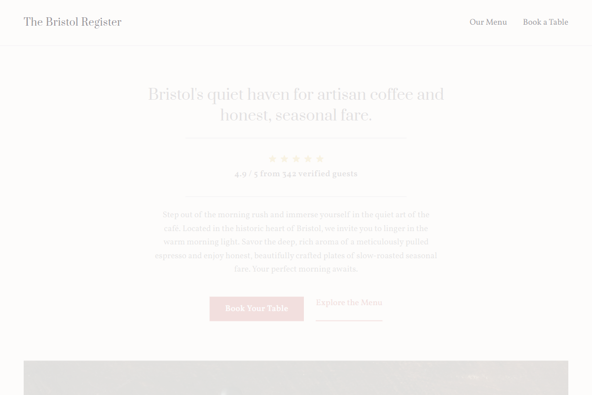
Design philosophy: a modern old-builder register built from pearl-white surfaces, charcoal-violet typography, pale cool-lilac grey bands, graphite dividers, golden review stars, and one lacquer-red accent for booking actions and selected active states. Core beliefs: atmosphere should be carried by type colour, disciplined modules, photographic sequencing, and social proof, not by café clichés. Strict rules: light horizontal navbar, split hero with natural image crop, restrained serif headline capped at 3xl, stars and review count immediately under the claim, centered credibility block, alternating image/text sections, table-like menu with generous leading, and unembellished location/opening rows. Typography philosophy: pair Prata, Ovo, or Rosarivo headings with Vollkorn, Charter, or Crimson Pro body in 17–18px. Spacing philosophy: repeatable gutters, tidy section padding, owner-editable rows. Motion philosophy: fades, fine link underlines, very slight image lift only. Imagery: black leather diaries, white china, handwritten menus, polished glass. Refuses avatars, badges, beige, glossy gradients, script excess. Common mistakes: sugary purple, generic red, huge headings, overfilled sections.
0 likes
0 bookmarks
Sep 17, 2026
Copy Design Aesthetic