Home
Templates
Design Systems
Use Cases
Contact
Back to design aesthetics
Share
Save
Polar White Inkberry Gazette Table
/polarWhiteInkberryGazetteTable
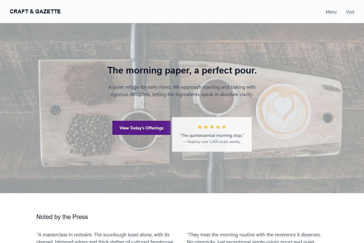
Design philosophy: create a restrained editorial café system inspired by local newspaper listings, printed menus, and quiet morning light, using polar white, blue-gray shadows, ink-charcoal text, and an inkberry-purple action colour. Core beliefs: sophistication should come from hierarchy, line length, and believable details rather than decoration. Strict rules: pale navbar, hero with soft interior or doorway photography, translucent social-proof panel with golden stars, inkberry CTA, plain secondary link, centered headline with review count, generous ruled sections, one dark inkberry band with warm-white copy, background-photo story panel, document-like menu table, and location details separated by hairlines. Typography philosophy: pair Scala Sans, FF Meta, or TheSans with IBM Plex Sans or Cabin; compact labels, moderate headings, strong body readability. Spacing: editorial, calm, maintainable. Motion: soft fades only. Imagery: window light, printed notices, cups, receipts. Refuses scripts, stickers, icon grids, beige. Mediocre implementation: gloomy purple restaurant page. Common mistakes: muddy overlays, oversized headings, weak CTA contrast.
0 likes
0 bookmarks
Aug 21, 2026
Copy Design Aesthetic