Home
Templates
Design Systems
Use Cases
Contact
Back to design aesthetics
Share
Save
Porcelain Blackcurrant Till Ledger
/porcelainBlackcurrantTillLedger
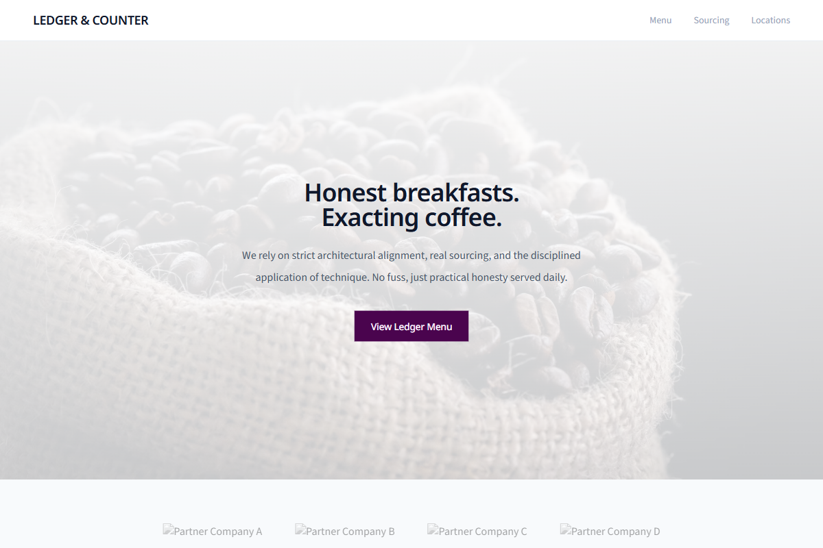
Design philosophy: design a memorable local-business landing page around the honesty of a till ledger, with just enough polish to feel world-class. Core beliefs: trust comes from practical content, real imagery, readable rows, and one unusual colour used with discipline. Strict rules: light porcelain navbar, 80vh hero image with subtle dark shade, blackcurrant CTA, understated menu link, centered welcome copy, small founder note or regulars’ quote, alternating feature sections, one blackcurrant block with pale text, background-image overlay strip, ledger-style menu with aligned prices, and location divided by fine rules. Typography philosophy: pair FF Meta, Scala Sans, Myriad Pro, or Noto Sans with Source Sans 3; compact labels, comfortable leading, no decorative café lettering. Palette: porcelain white, lavender-gray, pewter, blackcurrant, charcoal, tiny citrus accent. Spacing: steady, practical, builder-familiar. Motion: hover darkening only. Imagery: receipt paper, staff hands, counter light. Refuses badges, avatars, chalkboards, beige. Mediocre implementation: purple smeared everywhere. Common mistakes: muddy accent, misaligned menu rows, theatrical overlays.
0 likes
0 bookmarks
Aug 21, 2026
Copy Design Aesthetic