Home
Templates
Design Systems
Use Cases
Contact
Back to design aesthetics
Share
Save
Porcelain Counter Ledger & Bitter-Cocoa Black Accents
/porcelainCounterLedgerBittercocoaBlackAccents
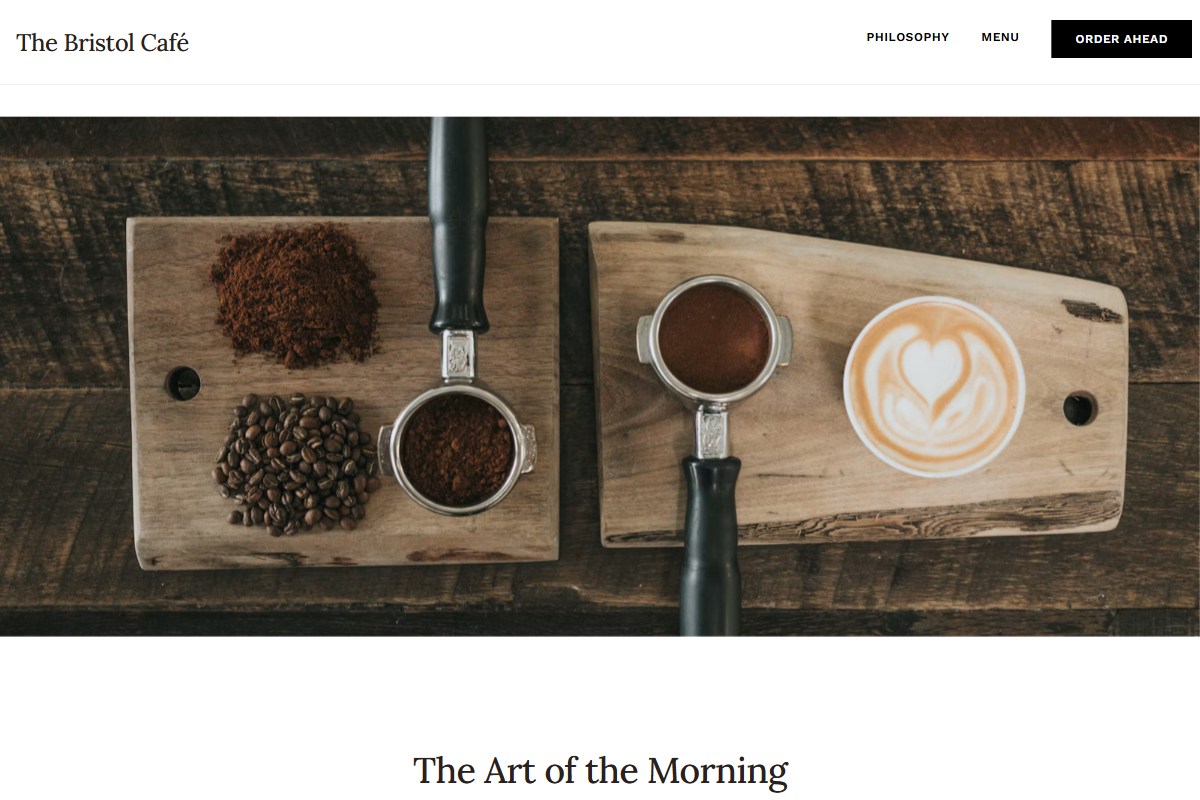
Design philosophy: a refined light-theme W3.css layout that feels like porcelain cups arranged on a dark counter: crisp white surfaces, mist-grey separators, bitter-cocoa text, golden yellow stars, and black accents used as confident editorial punctuation. Core beliefs: restraint, readable sections, excellent font pairing, and strong photo cropping should carry the design, not decoration. Strict rules: light navbar, no coloured section backgrounds beyond pale grey panels, hero under 3xl, squared CTAs, single-column menu ledger, practical contact area, plain footer. Typography philosophy: Lora or Cormorant Garamond headings paired with Noto Sans, Hind, or PT Sans; FAQ/category headings in Work Sans or Assistant; avoid hairline fashion contrast. Spacing philosophy: compact but breathable builder-site rhythm. Motion: nearly static, with subtle image settling. Imagery: white china, espresso gloss, black aprons, polished counters, handwritten chalk boards. Refuses beige, badges, avatars, ribbons, glossy cards. Common mistakes: bland minimalism, tiny serif copy, over-polished whitespace, fake vintage textures.
0 likes
0 bookmarks
Oct 12, 2026
Copy Design Aesthetic