Home
Templates
Design Systems
Use Cases
Contact
Back to design aesthetics
Share
Save
Porcelain Ink Pistachio Review Window
/porcelainInkPistachioReviewWindow
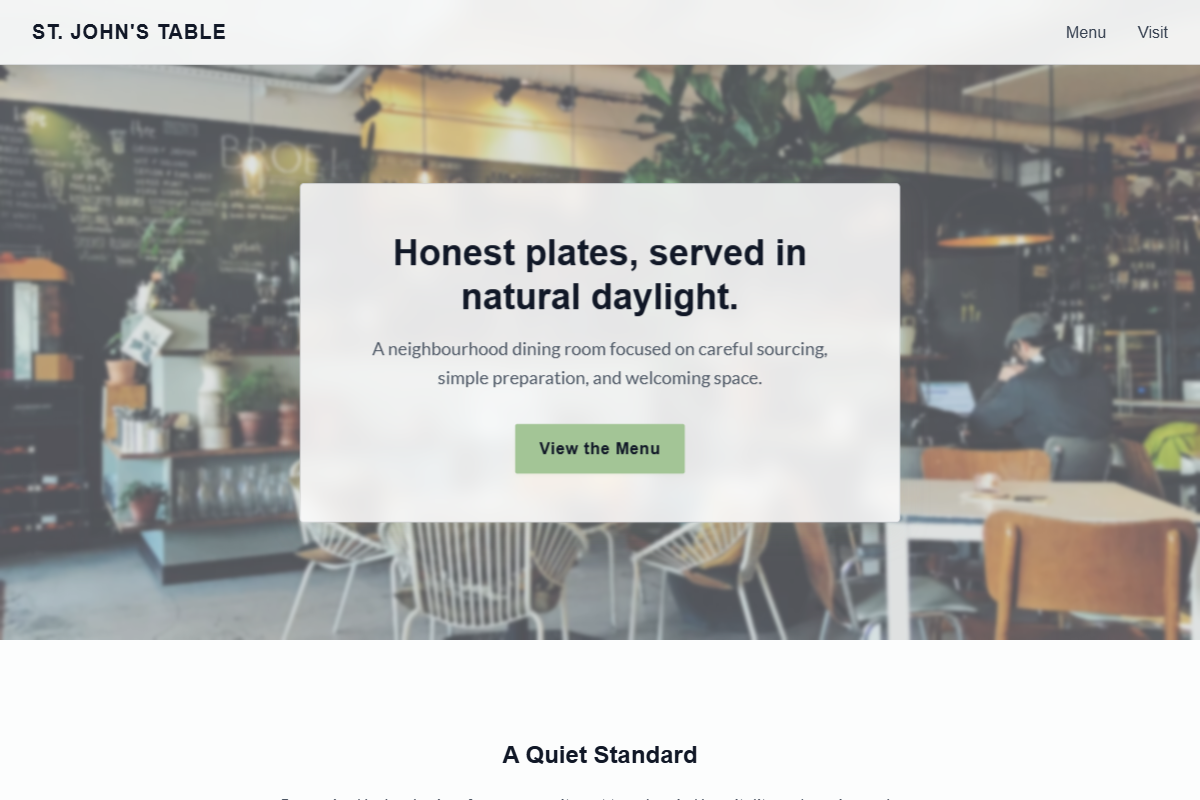
Design philosophy: build a calm local-business page from porcelain whites, ink-gray typography, pale green-gray shadows, and a muted pistachio action colour used with discipline. Core beliefs: freshness should be implied through daylight, spacing, and tone rather than leafy decoration. Strict rules: light porcelain navbar, 80vh hero with window, entrance, or table photography, glass review panel with golden stars, pistachio CTA with ink text if needed for contrast, simple menu link, centered headline and review-count section, two image-led feature bands, one pistachio note section, background-image story strip with restrained overlay, document-like menu table, and clear location/hours/contact layout. Typography philosophy: pair Gill Sans Nova, Frutiger, or Museo Sans with Cabin, Lato, or IBM Plex Sans; readable body copy over oversized headlines. Spacing: airy but not luxury sparse. Motion: opacity only. Imagery: daylight glass, plates, hands, notices. Refuses eco leaves, avatars, stickers, beige, generic mint gradients. Mediocre implementation: bland “fresh food” template. Common mistakes: low-contrast pistachio, decorative clutter, misaligned menu prices.
0 likes
0 bookmarks
Aug 21, 2026
Copy Design Aesthetic