Home
Templates
Design Systems
Use Cases
Contact
Back to design aesthetics
Share
Save
Porcelain Juniper Window Notice
/porcelainJuniperWindowNotice
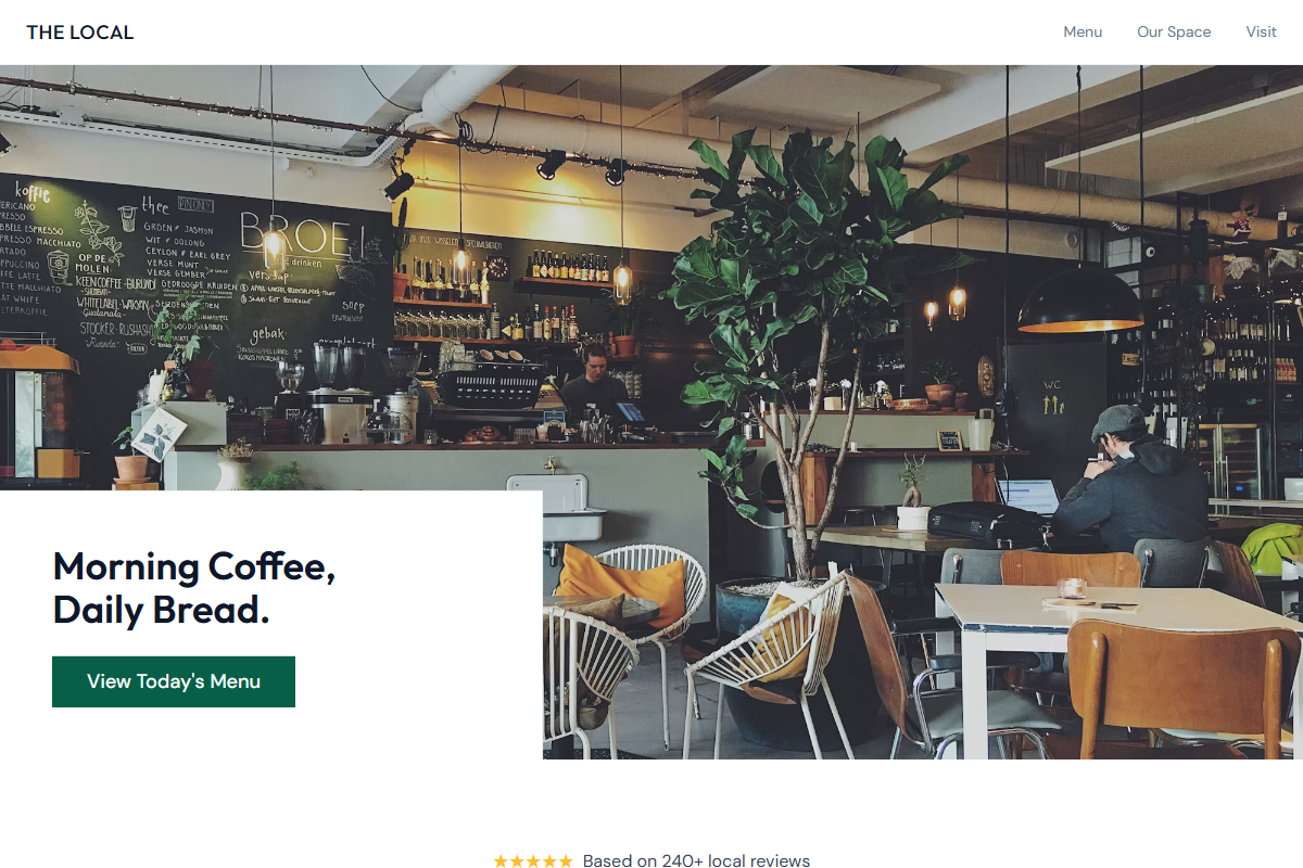
Design philosophy: stay in the classic owner-maintained café website family, but sharpen it with porcelain whites, cool grays, disciplined juniper actions, and a notice-like information structure. Core beliefs: locality, readability, review proof, and real images should carry the brand; decoration should be nearly invisible. Strict rules: light porcelain navbar, 80vh hero with window seating, doorway, till, or shopfront photography, juniper CTA, understated menu link, compact golden-star review line, centered welcome section with review count, alternating image-led feature bands, one juniper block with warm-white text, background-image story strip, ruled menu table with aligned prices, and location blocks separated by fine dividers. Typography philosophy: pair Frutiger, Scala Sans, Museo Sans, or Gill Sans Nova with Source Sans 3, Cabin, or dark DM Sans; controlled type scale, readable labels. Spacing: generous but builder-familiar, easy to maintain. Motion: underline hovers and subtle opacity only. Refuses badges, review widgets, chalkboards, beige, leafy clichés. Mediocre implementation: generic green “fresh food” page. Common mistakes: weak juniper contrast, cluttered reviews, inconsistent gutters.
0 likes
0 bookmarks
Aug 21, 2026
Copy Design Aesthetic