Home
Templates
Design Systems
Use Cases
Contact
Back to design aesthetics
Share
Save
Porcelain Tile Cobalt Ink & Lacquer-Cherry Counter Sheet
/porcelainTileCobaltInkLacquercherryCounterSheet
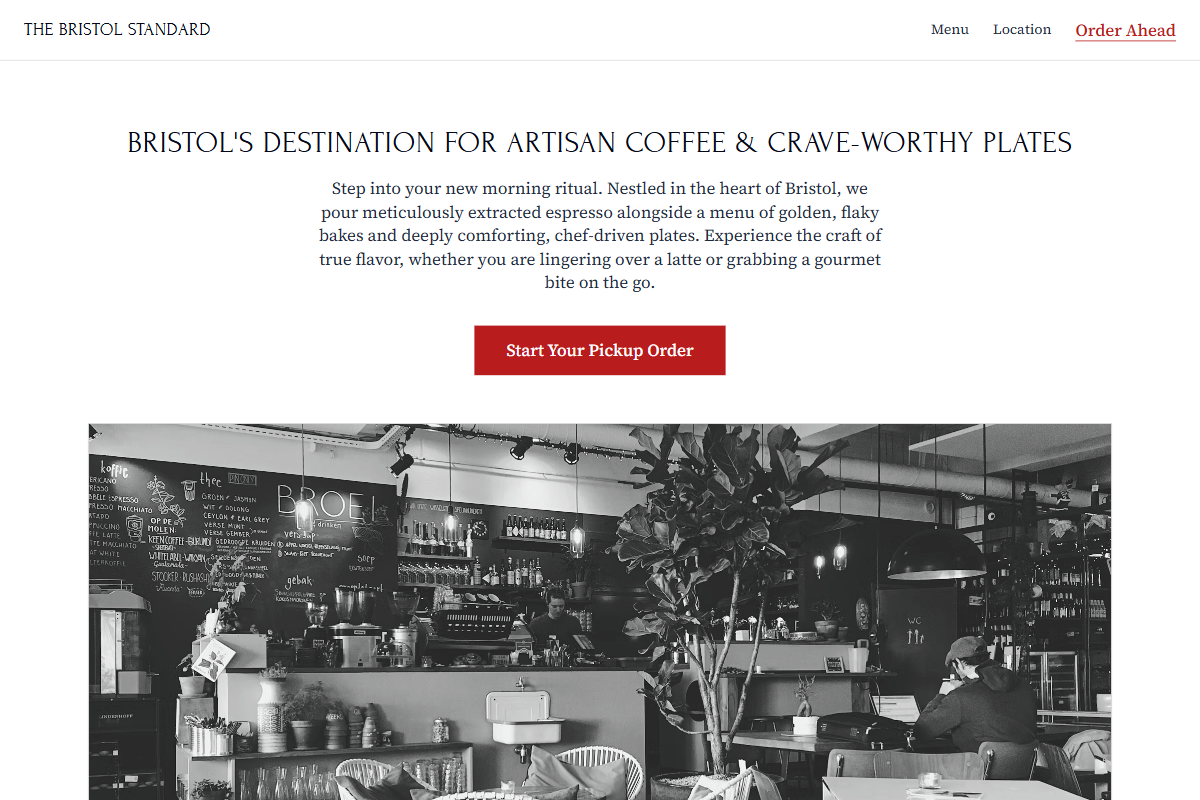
Design philosophy: a crisp tiled-counter aesthetic built from porcelain-white backgrounds, pale blue-grey tiled sections, deep cobalt-black typography, nickel rules, golden yellow stars, and lacquer-cherry red for buttons and active links only. Core beliefs: a local page can feel graphic, practical, and memorable without looking like software. Strict rules: light horizontal navbar, centered hero capped at 3xl, rectangular image below, one-column menu with strong ruled rows, 80%-width two-per-row image grid on a cool tile-blue ground, direct CTA, and plain footer. Typography philosophy: use Marcellus, Bellefair, or Forum for headings with Lusitana, Vollkorn, or Source Serif 4 body; keep body readable at 17–18px. Spacing: tidy gutters, slightly compressed section padding, strong left edges. Motion: soft opacity reveals, no parallax. Imagery: white tile, chrome, black coats, handwritten order slips, rain on windows. Refuses beige, doodles, stickers, app cards. Common mistakes: Mediterranean clichés, weak cobalt, generic cherry buttons, decorative clutter.
0 likes
0 bookmarks
Sep 20, 2026
Copy Design Aesthetic