Home
Templates
Design Systems
Use Cases
Contact
Back to design aesthetics
Share
Save
Slate Blue Modern Brasserie
/slateBlueModernBrasserie
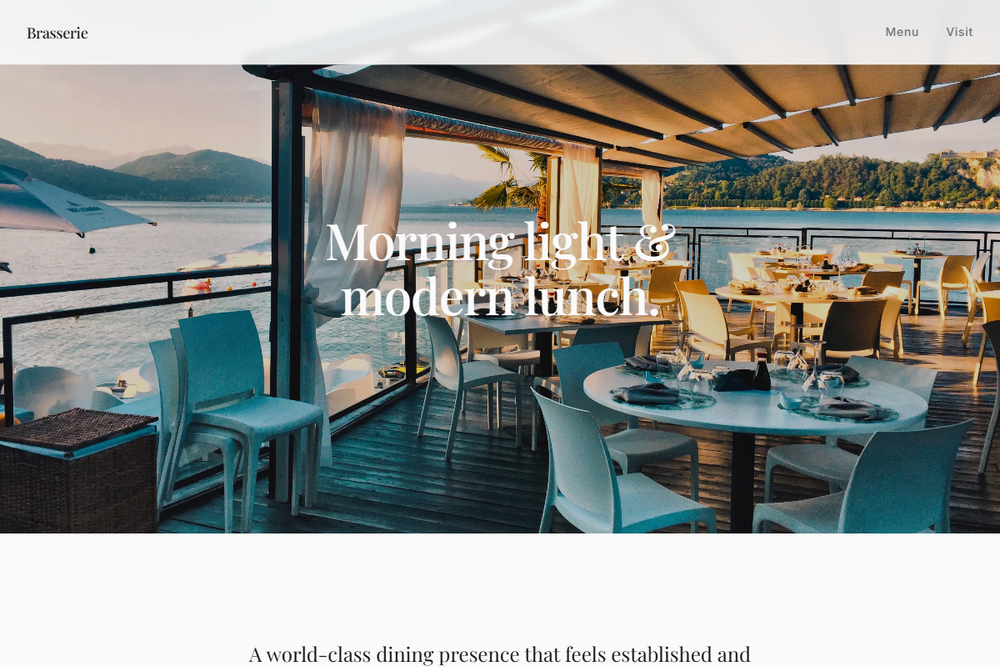
Design philosophy: build a world-class restaurant page that feels established, urbane, and maintainable without leaning on vintage theatre. Core beliefs: hierarchy should be created through typography, section pacing, and photography; blue should feel architectural rather than decorative. Strict rules: pale navbar, full-width 80vh hero with soft image overlay, serif headline set large but controlled, one slate-blue reservation CTA, one understated secondary link, centered statement section, alternating feature rows, a menu section with disciplined rules and aligned prices, and a location section split into address, hours, and directions. Typography philosophy: Portrait, Lyon, or Tiempos for headings, paired with Untitled Sans, Theinhardt, or Founders Grotesk for interface copy. Palette: gallery white, pale zinc, blue-gray rules, slate navy, charcoal, restrained vermilion accent. Spacing: wide gutters, readable line lengths, strong section pauses. Motion: underline and opacity transitions only. Imagery: banquettes, window light, table settings, service details. Refuses crests, badges, gold excess, chalkboards, and social proof clutter. Mediocre implementation: dark brasserie cliché. Common mistakes: muddy blues, heavy borders, oversized hero text.
0 likes
0 bookmarks
Aug 20, 2026
Copy Design Aesthetic