Home
Templates
Design Systems
Use Cases
Contact
Back to design aesthetics
Share
Save
Snow Porcelain Ink & Burnt-Ruby Magazine Index
/snowPorcelainInkBurntrubyMagazineIndex
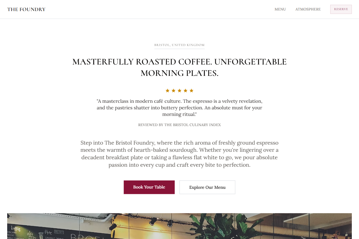
Design philosophy: a crisp editorial index built from snow-porcelain backgrounds, pale aluminium panels, soot-brown typography, brushed-steel rules, golden review stars, and a burnt-ruby accent used sparingly. Core beliefs: the page should feel assembled by a disciplined magazine designer—photographic, practical, and quietly atmospheric without becoming decorative. Strict rules: light horizontal navbar, rectangular hero photograph, hero headline capped at 3xl, immediate review proof, centered credibility paragraph, image-heavy content bands, ruled menu rows, and direct address/opening details. Typography philosophy: use Prata, Cormorant Infant, or Rufina for headings with Source Serif 4, Vollkorn, or Charter-style body. Spacing: medium gutters, compact vertical rhythm, strong left edges. Motion: slow fades, subtle image lift, no parallax. Imagery: polished silver, black coats, white china, folded schedules. Refuses SaaS cards, stickers, beige warmth, generic café icons. Common mistakes: over-romantic styling, weak greys, bright ruby, empty luxury spacing.
0 likes
0 bookmarks
Sep 20, 2026
Copy Design Aesthetic