Home
Templates
Design Systems
Use Cases
Contact
Back to design aesthetics
Share
Save
Snow Tile Persimmon Regulars’ Notice
/snowTilePersimmonRegularsNotice
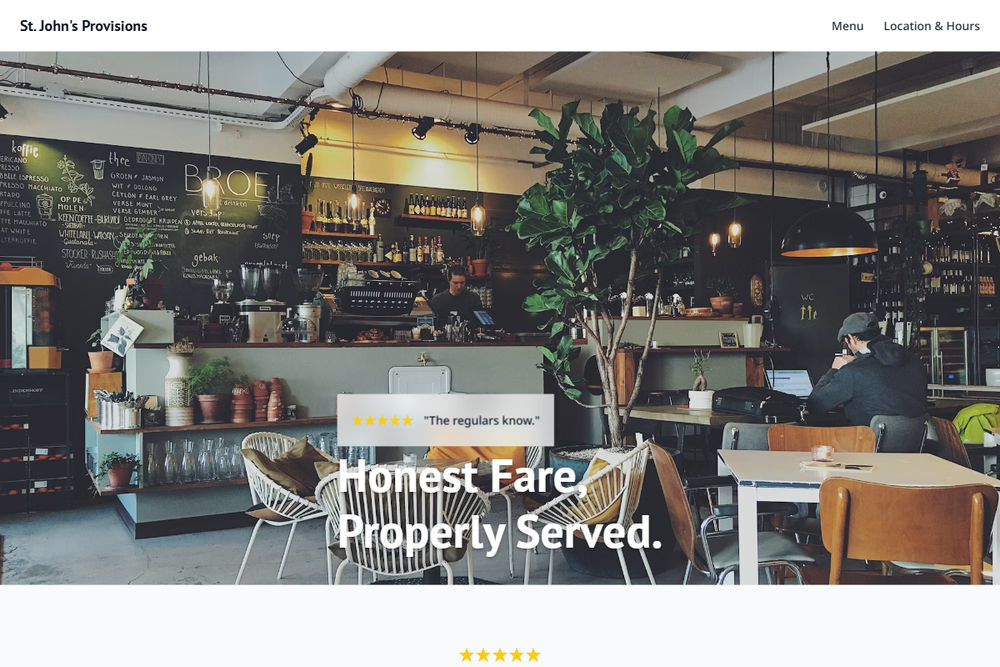
Design philosophy: build a bright tiled-counter aesthetic that feels civic, practical, and confidently local, with snow whites, cool tile grays, charcoal type, and a persimmon action colour borrowed from warm review energy. Core beliefs: world-class small-business design should be useful first, charming through proportion second. Strict rules: light snow navbar, 80vh hero with tiles, counter service, exterior signage, or daylight table photography, glassmorphic review proof with golden stars, persimmon CTA, plain menu link, centered intro with review count, two image-led sections, one persimmon feature band with charcoal text, background-photo story strip with restrained overlay, HTML-table menu with fine dividers, and clear location blocks. Typography philosophy: pair Benton Sans, Univers-style sans, or PT Sans with Noto Sans, Lato, or IBM Plex Sans; compact labels and readable body copy. Spacing: modular, consistent, not overly polished. Motion: underline hovers and button darkening only. Refuses SaaS cards, icon grids, gradients, beige, stock gloss. Mediocre implementation: orange smeared everywhere. Common mistakes: weak CTA contrast, cramped menu rows, inconsistent gutters.
0 likes
0 bookmarks
Aug 21, 2026
Copy Design Aesthetic