Home
Templates
Design Systems
Use Cases
Contact
Back to design aesthetics
Share
Save
Snow White Raspberry Review Notice
/snowWhiteRaspberryReviewNotice
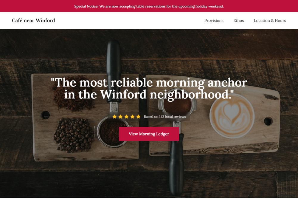
Design philosophy: design a crisp local-business page using snow-white backgrounds, pale pewter dividers, graphite serif text, golden-yellow review stars, and a restrained raspberry accent borrowed from social proof warmth rather than branding. Core beliefs: the page should feel like a carefully updated website-builder template made excellent through hierarchy, proportion, and authentic photography. Strict rules: simple light navbar, full-height hero with counter display or rainy frontage image, star rating near primary actions, centered proof-led headline, owner-editable story bands, document-style menu table, one raspberry information strip, atmospheric background-photo text overlay, and clear address/hours/contact module. Typography philosophy: pair Tiempos Text, Lyon Text, or Sabon with Source Serif 4 or Georgia; all-serif, readable, never fashion-thin. Spacing: consistent gutters, compact labels, generous line-height. Motion: opacity only. Imagery: trays, printed notices, till counter, window reflections. Refuses stickers, chalkboards, avatars, beige, generic café illustrations. Mediocre implementation: bright pink bakery flyer. Common mistakes: sugary accent, low-contrast overlays, decorative borders.
0 likes
0 bookmarks
Aug 24, 2026
Copy Design Aesthetic