Home
Templates
Design Systems
Use Cases
Contact
Back to design aesthetics
Share
Save
Snowdrop Ink Village Menu Sheet
/snowdropInkVillageMenuSheet
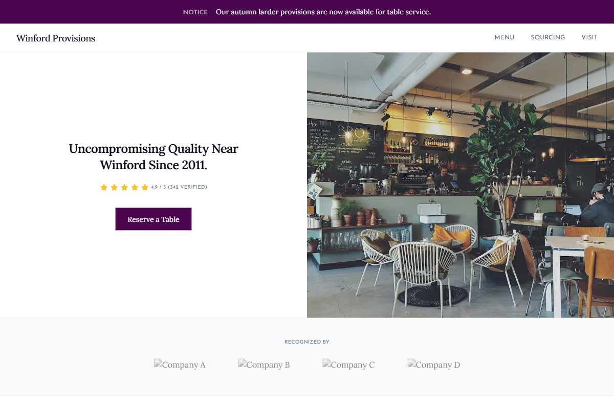
Design philosophy: a crisp light-theme landing page that feels like a carefully maintained local-business document, using snowdrop-white backgrounds, cool gray dividers, ink-navy typography, golden review stars, and a restrained damson accent for decisive actions. Core beliefs: clarity, proof, and useful information should create charm before decoration does. Strict rules: elegant slim navbar, split hero with rain-lit frontage or table-service photography, visible star rating near CTAs, centered credibility headline, two simple owner-editable content bands, fine-ruled HTML menu, damson notice panel, and precise address/hours/contact module. Typography philosophy: pair Tiempos Text, Miller Text, or Georgia Pro with FF Meta, Humanist 521, or Josefin Sans for labels. Spacing: consistent gutters, compact labels, generous body leading. Motion: soft opacity only. Imagery: glass reflections, till counters, printed notices. Refuses decorative nostalgia, beige, stickers, avatars. Mediocre implementation: navy corporate restaurant site. Common mistakes: oversized headings, muddy accents, sterile stock photography.
0 likes
0 bookmarks
Aug 24, 2026
Copy Design Aesthetic