Home
Templates
Design Systems
Use Cases
Contact
Back to design aesthetics
Share
Save
Snow-White India Ink & Raspberry Proof Folio
/snowwhiteIndiaInkRaspberryProofFolio
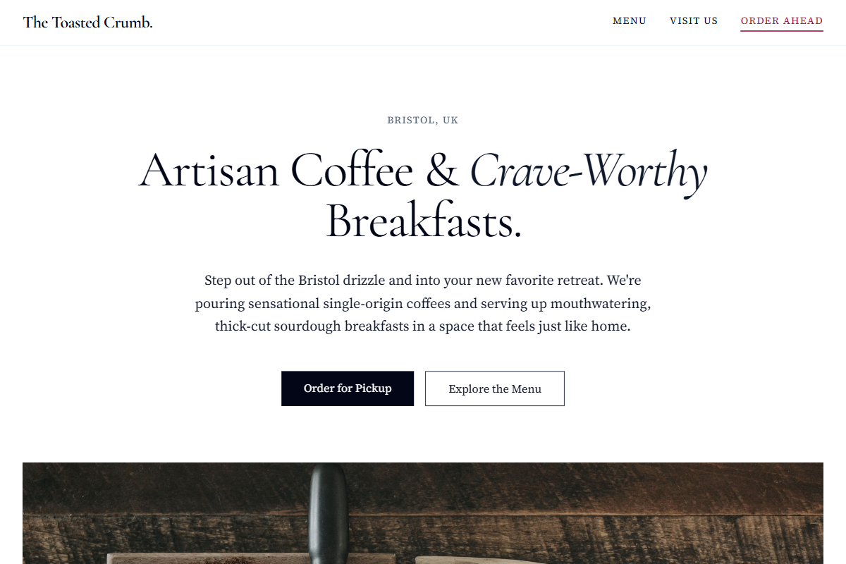
Design philosophy: a sharper monochrome editorial landing page built from snow-white fields, pale cool-grey panels, india-ink typography, black primary buttons, golden yellow review stars, and one dry raspberry accent for active nav and a single proof link. Core beliefs: restraint should not mean dullness; contrast, typography, and photographic cropping create the character. Strict rules: slim light navbar, asymmetrical hero with one strong café photograph, centered credibility block, two-column editorial sections, ruled HTML-table-style menu, and a practical map/location footer. Typography philosophy: use Cormorant Garamond, Fanwood Text, or Prata for headings with Baskerville, Literata, or Source Serif 4 body; keep body generous at 17–18px. Spacing: bookish margins, repeatable gutters, no luxury emptiness. Motion: opacity reveals, slight image lift, no parallax spectacle. Imagery: silverware, cake stands, glass reflections, exterior frontage. Refuses cute illustrations, stickers, beige warmth, SaaS cards. Common mistakes: sugary raspberry, over-polished restaurant styling, cramped menu rows.
0 likes
0 bookmarks
Sep 15, 2026
Copy Design Aesthetic