Home
Templates
Design Systems
Use Cases
Contact
Back to design aesthetics
Share
Save
Sprightly Menu Grid Modernism
/sprightlyMenuGridModernism
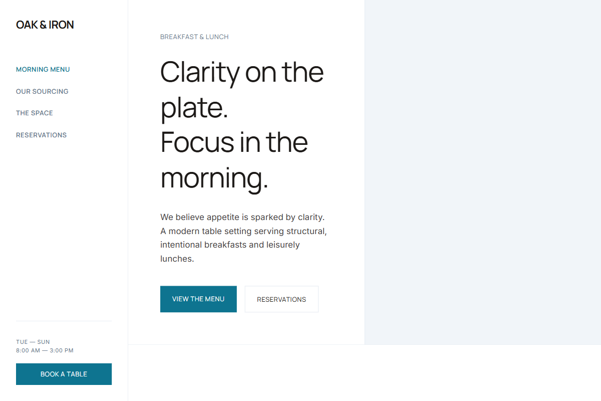
A highly templatable restaurant-style landing page aesthetic focused on structured menu presentation, confident imagery, and modernized 2016-era clarity. Use Circular, Cera Pro, or Manrope for headings and UI, paired with Inter or DM Sans for body text. Keep the hero headline at 48–56px, body copy at 17px, nav links at 13px uppercase, section headings at 34–42px, and menu card text compact but readable. Use crisp white, cool off-white, blue-tinted gray, light taupe, charcoal brown, and marine blue as the primary action color. Start with a full-bleed hero image and left-side identity stack, then move into a centered menu grid with category tabs, fine dividers, and subtle hover states. Follow with split photo/text sections, full-width image bands, and centered copy blocks on pale surfaces. Prioritize clean spacing, strong art direction, reusable content modules, and minimal decoration.
0 likes
0 bookmarks
Jul 25, 2026
Copy Design Aesthetic